Make a Beautiful Interactive Bitcoin Price Chart with React, D3, and VX

Intro
Interactive charts can seem intimidating. They were for me, and some still are but after spending time diving into them for work I've learned they aren't as intimidating. There are a few key concepts we'll go over that helped me unlock visualizations. It was the AHA! moment that I needed and I hope to teach you as well.
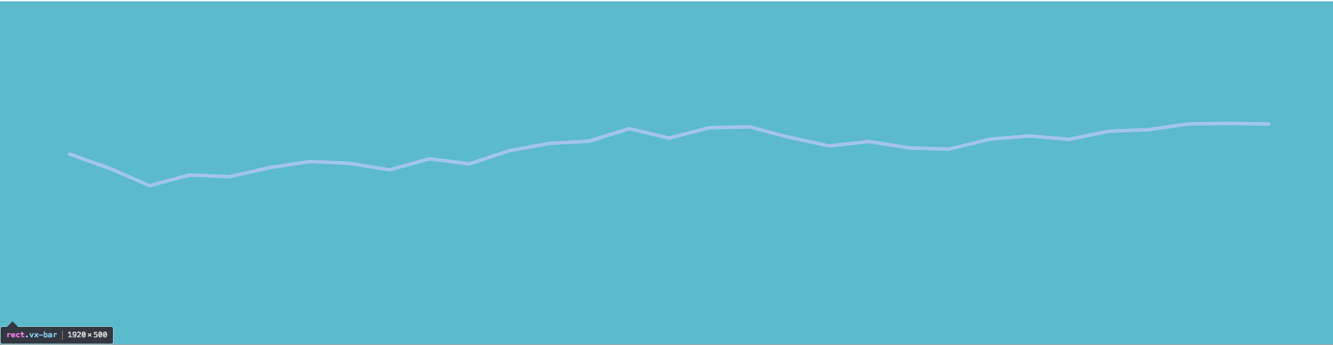
This is what we're building, check out the Live Demo before you dive in.
Setup
First thing we need to load our data. So it's easier to work with we process it a little bit.
We receive the data in a {"2018-02-05" : 9999, "2018-02-06": 8888} structure which is more difficult to work with when you or a library needs to work on data with functional calls like .map.
We do that with this code here.
Object.keys(data.bpi).map((date) => {
  return {
    date,
    price: data.bpi[date],
  };
});
Which takes the bpi (I assume bitcoin price index) and gets the keys. Those keys happen to be the date that we want. We'll map over all of it and return the date, and then our data.bpi[date] which is going to be our price. This all returns an array of objects like so.
[
  {
    date: "2018-02-05",
    price: 9999,
  },
  {
    date: "2018-02-06",
    price: 8888,
  },
];
Thanks to CoinDesk for providing an API of data.
import React, { Component } from "react";

class App extends Component {
  state = {
    data: null,
  };
  async componentDidMount() {
    const res = await fetch(
      "https://api.coindesk.com/v1/bpi/historical/close.json"
    );
    const data = await res.json();

    this.setState({
      data: Object.keys(data.bpi).map((date) => {
        return {
          date,
          price: data.bpi[date],
        };
      }),
    });
  }

  render() {
    const { data } = this.state;
    if (!data) return null;

    return <div />;
  }
}
Add dependencies
First thing we need to do is install our dependencies.
npm install @vx/curve @vx/event @vx/scale @vx/shape @vx/tooltip d3-array d3-time-format
We're using vx a library from https://twitter.com/hshoff a developer at AirBnB.
We also add in d3-array and d3-time-format. vx does a lot but still requires us to do some low-level work. This might seem more difficult but it provides us with the ability to learn what's really happening, and also accomplish the exact chart we want versus other charting libraries that just spit out a default chart.
Width/Height
We do need to define width and height. This will be required for rendering our SVG, as well as determining how we need to render our data. This might be something more specific for you and your rendering needs but we'll just render it the size of the screen. We use the window.innerWidth and window.innerHeight to get those values.
import React, { Component } from "react";

const width = window.innerWidth;
const height = window.innerHeight;

class App extends Component {
  render() {
    const { data } = this.state;
    if (!data) return null;

    const padding = 100;
    const xMax = width - padding;
    const yMax = height - padding;

    return <div />;
  }
}
Additionally the padding is to give us some cushion on either sides. Without the padding the SVG rendering will go right up to the edge. That means our line will touch the edge and additionally our tooltips.
Since SVGs will only show the content within the width/height that you've defined it will cause our tooltips to be clipped. So just to be safe we give ourselves padding.
Here we're defining our xMax and yMax. Those will become more clear in a second.
Create a Green Square
So lets get our work area setup. We create a wrapping div to render some additional tooltip elements later.
We set out svg to our width and height we defined earlier. To render a rectangle in SVG land we use the rect element. We must define a few props.
First our x and y. This defines the top left corner of where we want to start rendering out rectangle. Then we define a width/height which will just be our entire SVG space. Finally so people can see it we fill it in with a color. This is equivalent to using background-color in CSS.
render() {
  return (
    <div>
      <svg width={width} height={height}>
        <rect x={0} y={0} width={width} height={height} fill="#32deaa" />
      </svg>
    </div>
  )
}
So great. We now have a blank green square all setup taking up the entire screen!

Setup Data Processors
Now comes our data selectors.
import React, { Component } from "react";
import { scaleTime, scaleLinear } from "@vx/scale";
import { extent, max } from "d3-array";

const width = window.innerWidth;
const height = window.innerHeight;

const xSelector = d => new Date(d.date);
const ySelector = d => d.price;

//...
render() {
  const { data } = this.state;

  if (!data) return null;

  const padding = 100;
  const xMax = width - padding;
  const yMax = height - padding;

  const xScale = scaleTime({
    range: [padding, xMax],
    domain: extent(data, xSelector),
  });

    const dataMax = max(data, ySelector);
    const yScale = scaleLinear({
      range: [yMax, padding],
      domain: [0, dataMax + (dataMax / 3)],
    });
}
Here we are defining the bounds of our rendering outputs. We've set a yMax to be the entire height we have defined minus 100px. Same goes for the xMax.
const padding = 100;
const xMax = width - padding;
const yMax = height - padding;
These are just JavaScript functions. They take in data as an object and return the selected value.
const xSelector = (d) => new Date(d.date);
const ySelector = (d) => d.price;
Alright now comes a function you may have never seen before. This is from @vx/scale but is actually a helper method on top of d3-scale. So this is basically raw D3.
The scaleLinear receives a range and a domain. What this does is takes arrays of data and provides a way to take a value and preserve proportional differences and turn it into a renderable point.
Not only can it take a value and get a renderable y value but also the reverse! More on that later.
const dataMax = max(data, ySelector);
const yScale = scaleLinear({
  range: [yMax, padding],
  domain: [0, dataMax + dataMax / 3],
});
Lets disect this further as it's one of the most important concepts to grasp in rendering visualizations.
First our range: [yMax, padding]. We define the limit to be the yMax which is the height - padding and the final edge of our rendering abilities to be our padding.
The domain is the bounds of our data. We don't expect our prices to go below 0. Then we use the max from d3-array to loop over all our data. Provide it our ySelector which will get passed each data point and return the price. The max function will then return the top number it finds.
We then add some padding to the top of our data with a third of our maximum data.
The way this is setup with range and domain will map our yMax from our range to the first piece of the domain array. So if our yMax is 800, and we ask yScale where to render a price of $0. It would say at 800. Which would be the BOTTOM of the SVG.
Now what if we our dataMax was 15,000 and we asked yScale where to render?
It would return our padding which is 100 and the TOP of the SVG. Well this is sort of true, we added an extra 5000 (15000/3) to the top so yScale would figure out the extra coordinate to render at.
Hopefully you're seeing the the power now. A scale function allows us to define the bounds of our chart, and connect it to the data in a proporotional manner. So if the size of SVG changes our data points will still be scaled and rendered in the correct spots.
const xScale = scaleTime({
  range: [padding, xMax],
  domain: extent(data, xSelector),
});
Now the same goes for xScale here as it did for yScale. However we're using scaleTime rather than scaleLinear as it's built for handling dates.
Some solutions you may observe might use the index of the array item for x. However this just means to render you need to do a data lookup. D3 provides helper methods to do this that are even more powerful.
The scaleTime would allow you to ask about ANY date within the domain range and where to render it exactly. If we used an integer here we would only ever be able to render the exact dates provided via the data.
We aren't going to use this power but it's good to know about.
We use extent which returns the top and bottom dates. The output of the extent call would be an array of 2 dates, [earliestDate, lastDate].
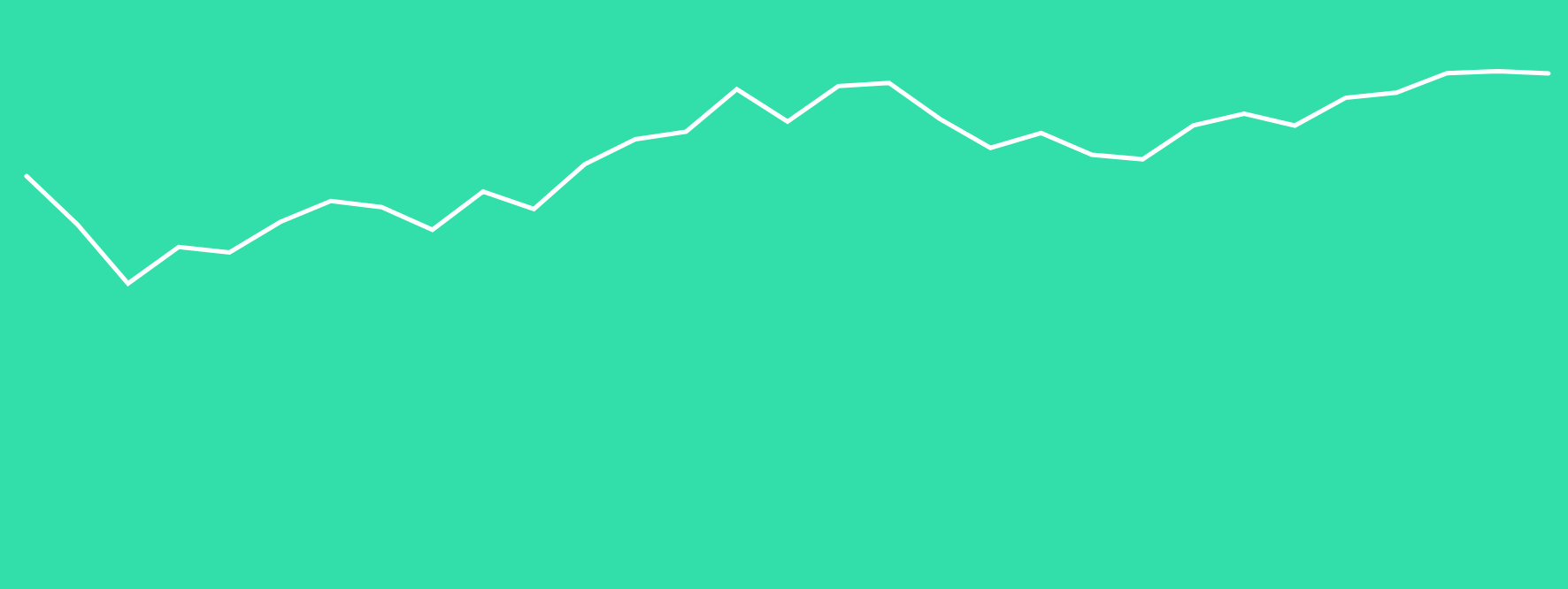
Create a "LinePath"
Now that we understand the data processors we setup lets use them. LinePath is a helper shape from vx.
It takes an array of data ( our bitcoin prices), our scales, and our selectors.
It will loop over each piece of data, use our xSelector/ySelector to get the data point, then it will pass it to our xScale/yScale to find the exact pixel coordinates to render to.
import { LinePath } from "@vx/shape";
/* Other Code */

render() {
  return (
    <div>
      <svg width={width} height={height}>
        <rect x={0} y={0} width={width} height={height} fill="#32deaa" />
        <LinePath
          data={data}
          xScale={xScale}
          yScale={yScale}
          x={xSelector}
          y={ySelector}
          strokeWidth={5}
          stroke="#FFF"
          strokeLinecap="round"
          fill="transparent"
        />
      </svg>
    </div>
  )
}
Bar to Catch Mouse Movements
We need a way to catch all mouse events. We render a Bar on top of the entire SVG. This is equivalent to using a rect element it adds some helper injection.
It looks through all the props and if it detects a function like onMouseMove it will wrap it and pass through the data. We have easy access to our data but there may be a time when you don't.
This will ensure you have access to your data for all of your events. That's also the reason for this data => event =>. A function that returns a function. We put our data in scope, return an event handling function that will get called with the event and then do something with it.
In our case we want to show/hide tooltips.
import { Bar, LinePath } from "@vx/shape";
/* Other Code */

<svg width={width} height={height}>
  <rect x={0} y={0} width={width} height={height} fill="#32deaa" />
  <LinePath
    data={data}
    xScale={xScale}
    yScale={yScale}
    x={xSelector}
    y={ySelector}
    strokeWidth={5}
    stroke="#FFF"
    strokeLinecap="round"
    fill="transparent"
  />
  <Bar
    x={0}
    y={0}
    width={width}
    height={height}
    fill="transparent"
    data={data}
    onMouseMove={data => event => /* Show the tooltip */}
    onMouseLeave={data => event => /* Hide the tooltip */}
  />
</svg>
Now the reason we add this Bar in is so that we have an entire area to catch our mouse movements.
If we attached them to the LinePath we'd only get them when they are directly with in the bounds of our line like so. You can see that is a very limited area.
If we place them on our Bar we get the entire area of mouse movement events and can generate a much better experience for our users.
Tooltip Handler
import { localPoint } from "@vx/event";
import { extent, max, bisector } from "d3-array";

const bisectDate = bisector(xSelector).left;

class App extends Component {
  /* Other Code */
  handleTooltip = ({ event, data, xSelector, xScale, yScale }) => {
    const { showTooltip } = this.props;
    const { x } = localPoint(event);
    const x0 = xScale.invert(x);
    const index = bisectDate(data, x0, 1);

    const d0 = data[index - 1];
    const d1 = data[index];
    let d = d0;
    if (d1 && d1.date) {
      d = x0 - xSelector(d0) > xSelector(d1) - x0 ? d1 : d0;
    }

    showTooltip({
      tooltipData: d,
      tooltipLeft: xScale(xSelector(d)),
      tooltipTop: yScale(ySelector(d)),
    });
  };
}
/* Other Code */

export default App;
localPoint is just a helper method.
The invert method is from xScale. This is what I was previously talking about reversing from a rendered pixel coordinate to an actual value. What this will do is take our mouse coordinate, ask our xScale that given a specific rendered coordinate what is the value that would produce that.
In our case it's going to return a date. So rather than taking a value and turning into pixel coordinates, it takes a pixel coordinate and turns it back into a value we can use.
const { x } = localPoint(event);
const x0 = xScale.invert(x);
Another function from D3! What is this magical bisector and what does it do?
Well the real intention is for when you're inserting data.
We create a bisector, tell it what data to look for and in our case we just give it our xSelector to get the date.
const bisectDate = bisector(xSelector).left;
//
const index = bisectDate(data, x0, 1);
Here is a quick example. Given [1,2,3,4,5,6] and I asked you to add 2.5 to this array, where would it go?
Well it would go here [1,2,2.5,3,4,5,6] at index 2.
What if I asked you to add 3 instead? It could go at index 2, or at index 3! Well that's what the .left indicates. You can either choose left or right. Left would give you 2 or right would give you 3.
We aren't using it for insertions though. We're using it so we can determine what price we're close to.
const index = bisectDate(data, x0, 1);
Given our data, and a date from our xScale.invert we want to know what data point our mouse is currently close to. The ending 1 to the bisectDate call is just saying to never return an index less than 1.
Now that we have our index we need to know which point we are closer to. If we don't do this math we will have to be directly over specific values and also won't ever be able to hover over index 0.
We get our 2 possible data points and store them as d0 and d1.
Then if we have a second data point we need to compare which one is closer to our mouse.
const d0 = data[index - 1];
const d1 = data[index];
let d = d0;
if (d1 && d1.date) {
  d = x0 - xSelector(d0) > xSelector(d1) - x0 ? d1 : d0;
}
The absolute key thing here is that x0 is a date. It's a date returned from xScale.invert. It's not necessarily a date that is in our data set. It's a date that our xScale figured out from a pixel coordinate.
When we do x0 - xSelector(d0) what's happening is it's becoming x0 - new Date("2018-02-05") which with the magic of JavaScript coercion turns into x0 - 1517788800000. So When we replace our x0 with a mouse coordinate we can determine whether or not our data point 0 or data point 1 is closer to the mouse.
showTooltip({
  tooltipData: d,
  tooltipLeft: xScale(xSelector(d)),
  tooltipTop: yScale(ySelector(d)),
});
Finally we'll call showTooltip with our data. We have our data point d. Then in order to determine the x and y points to render our tooltip at we use our x/y Selectors to get our values (date/price) and then ask our x/y Scale what the coordinates it should be rendered at.
We haven't set this up yet but it's provided by vx and we'll setup all up next.
Setup Tooltip Display
First off we need to import our withTooltip HOC and Tooltip from vx. Additionall we destructure some injections from our withTooltip HOC.
import { withTooltip, Tooltip } from "@vx/tooltip";

// in render
const { showTooltip, hideTooltip, tooltipData, tooltipTop, tooltipLeft } =
  this.props;
The withTooltip surrounds our App component with a <div> element with position: relative set on it so we can render absolutely positioned elements easier. Also it adds in showTooltip, hideTooltip, tooltipData, tooltipTop, tooltipLeft so we can hold state up above easier and have it injected into our component as props thus making it available everywhere.
export default withTooltip(App);
Then attach onMouseMove and onMouseLeave to our Bar. When we leave our SVG we'll hide our tooltip, and while it's moving over the top we'll call handleTooltip with all necessary info.
The reason we need to pass in our xScale/yScale is those are defined in render and not available in our handleTooltip function.
<Bar
  x={0}
  y={0}
  width={width}
  height={height}
  fill="transparent"
  data={data}
  onMouseMove={(data) => (event) =>
    this.handleTooltip({
      event,
      data,
      xSelector,
      xScale,
      yScale,
    })}
  onMouseLeave={(data) => (event) => hideTooltip()}
/>
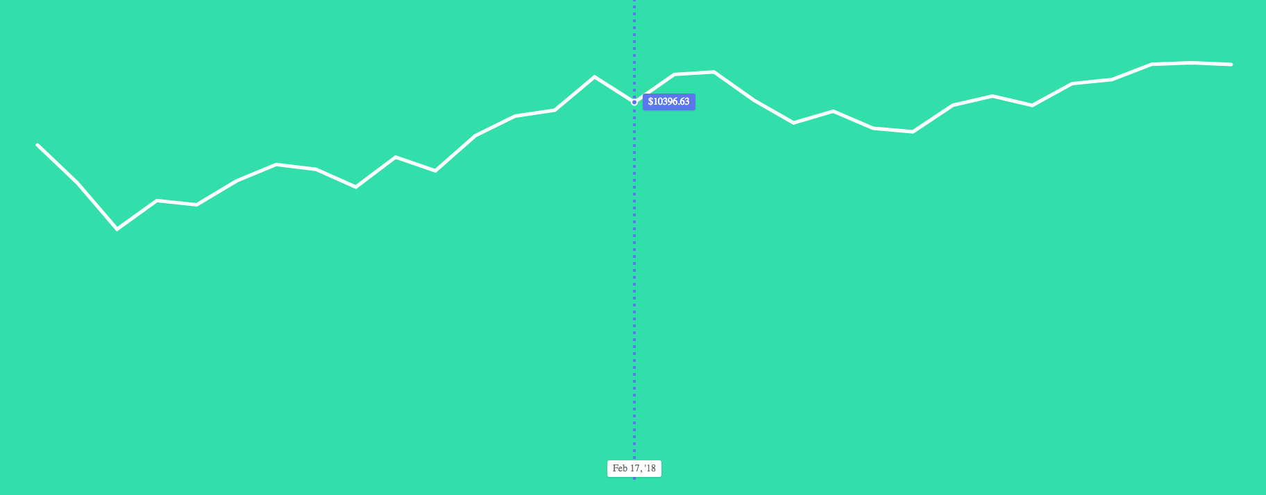
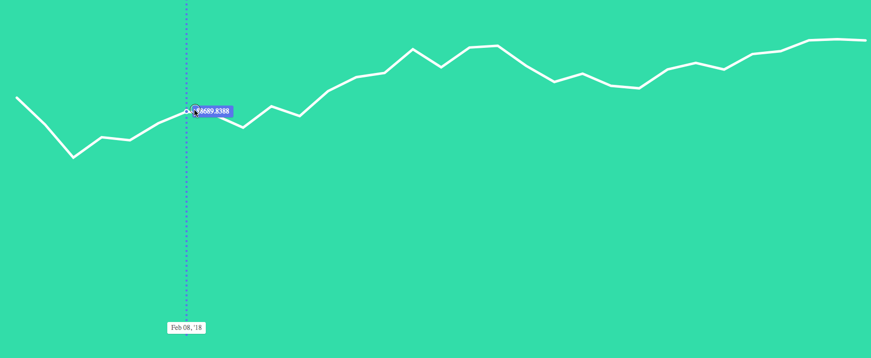
Inside our SVG we want to render a Line indicating what data point we are at. This is done by defining a from and a to which are coordinates. These are what we used all the work in our handleTooltip call to figure out.
The x for both will be at the same point because we're rendering at a specific spot horizontally. We then need to tell our Line to stretch from the top to the bottom. We do that using 0 for the top and our yMax as the bottom of the svg.
We also render a circle at the specific data point on the line. Both Line and our cirlce have some general styling applied. This can be changed by you to meet whatever your styling desires are. Notice also we're not rendering any text values, just shapes.
import { Line, Bar, LinePath } from "@vx/shape";
//...
{
  tooltipData && (
    <g>
      <Line
        from={{ x: tooltipLeft, y: 0 }}
        to={{ x: tooltipLeft, y: yMax }}
        stroke="#5C77EB"
        strokeWidth={4}
        style={{ pointerEvents: "none" }}
        strokeDasharray="4,6"
      />
      <circle
        cx={tooltipLeft}
        cy={tooltipTop}
        r={4}
        fill="#5C77EB"
        stroke="white"
        strokeWidth={2}
        style={{ pointerEvents: "none" }}
      />
    </g>
  );
}
Then outside our SVG we render our tooltips. This is a div that has some styling and is absolutely positioned. We provide the first Tooltip with our price and position it where our data point is (minus some offset so it doesn't cover our circle) and provide some addtional styling.
Same goes for our Tooltip to render our date. We pass in our tooltipData to our xSelector then to a formateDate function we created. This uses the timeFormat from D3 to take a date and render it in a human readable fashion.
//up above
const formatDate = timeFormat("%b %d, '%y");

{
  tooltipData && (
    <div>
      <Tooltip
        top={tooltipTop - 12}
        left={tooltipLeft + 12}
        style={{
          backgroundColor: "#5C77EB",
          color: "#FFF",
        }}
      >
        {`$${ySelector(tooltipData)}`}
      </Tooltip>
      <Tooltip
        top={yMax - 30}
        left={tooltipLeft}
        style={{
          transform: "translateX(-50%)",
        }}
      >
        {formatDate(xSelector(tooltipData))}
      </Tooltip>
    </div>
  );
}
Mobile
To make this work on mobile, don't forget to wire up touch events. These are equivalent of the mouse events but will register when users use their fingers to touch the graph.
onTouchEnd={data => event => hideTooltip()}
onTouchMove={data => event =>
this.handleTooltip({
  event,
  data,
  xSelector,
  xScale,
  yScale,
})}
Pre-Ending
This is may seem extremely complicated but breaking down a visualization into it's pieces and figuring those out separately will help you achieve any other visualization.
We first rendered a square, then how to translate our data, then rendered it as a LinePath. Next was to make it interactive. We got a Bar wired up to catch mouse coordinates, figured out where to render, then finished up by rendering our Tooltip and interactive works.
Ending
The vx library adds a nice mix between helping you render data and letting you choose how it is rendered to achieve the exact interactive visualization that you want.
If you want to play with it live you can check out the Live Demo