React-Native Press and Hold Button Actions

Introduction
Another common interaction is the press and hold to fire an action. Sometimes it's delete, sometimes it's save, but whatever it is you want to provide feedback to your user. React Native ships with a few Touchable components like TouchableOpacity, TouchableHighlight and also TouchableBounce that provide feedback to users but we'll build a button that fills up over a set period of time then triggers an action.
Setup
Lets do some code setup.
var React = require("react-native");

var {
  AppRegistry,
  StyleSheet,
  Animated,
  View,
  Text,
  TouchableWithoutFeedback,
} = React;

var ACTION_TIMER = 400;
var COLORS = ["rgb(255,255,255)", "rgb(111,235,62)"];
We'll pull in the normal components from React Native and additionally setup some variables to use later. ACTION_TIMER will be how long the animation will take before it fires the action, the COLORS will be the start and end colors. This animtion will transition from white to a brightish green. Remember that animated interpolations do not work with hex.
Base Component With StyleSheet
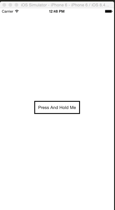
var AnimatedButtonPress = React.createClass({
  getInitialState: function () {
    return {
      textComplete: "",
    };
  },
  render: function () {
    return (
      <View style={styles.container}>
        <TouchableWithoutFeedback>
          <View style={styles.button}>
            <Animated.View style={styles.bgFill} />
            <Text style={styles.text}>Press And Hold Me</Text>
          </View>
        </TouchableWithoutFeedback>
        <View>
          <Text>{this.state.textComplete}</Text>
        </View>
      </View>
    );
  },
});

var styles = StyleSheet.create({
  container: {
    flex: 1,
    flexDirection: "column",
    alignItems: "center",
    justifyContent: "center",
  },
  button: {
    padding: 10,
    borderWidth: 3,
    borderColor: "#111",
  },
  text: {
    backgroundColor: "transparent",
    color: "#111",
  },
  bgFill: {
    position: "absolute",
    top: 0,
    left: 0,
  },
});
To start out, for this to work we obviously don't need the textComplete but that's just going to be our visual feedback to let us know when the action completes.
We setup a TouchableWithoutFeedback so we can get access to a few press handlers without directly using the PanResponder. Next we create a wrapping button view, add some text, and most importantly we create an Animated.View.
We set it to be position absolute so it doesn't effect layout and sits behind the text, and set it to the top: 0 and left: 0 so it is position at the furthest top and left of the component. I'll explain later why we don't set bottom:0 here as well.
Create The Animated
  getInitialState: function() {
    return {
        pressAction: new Animated.Value(0),
        textComplete: ''
    };
  },
  componentWillMount: function() {
    this._value = 0;
    this.state.pressAction.addListener((v) => this._value = v.value);
  },
UPDATE: getAnimatedValue is no longer accessable in the Animated API.
We need to attach a listener so that we can save off the value to use later. This allows us to track the value of the animation so we can confirm the user has held it for an appropriate length of time.
Handle The Presses
handlePressIn: function() {
    Animated.timing(this.state.pressAction, {
        duration: ACTION_TIMER,
        toValue: 1
    }).start(this.animationActionComplete);
},
handlePressOut: function() {
    Animated.timing(this.state.pressAction, {
        duration: this._value * ACTION_TIMER,
        toValue: 0
    }).start();
},
animationActionComplete: function() {
    var message = '';
    if (this._value === 1) {
        message = 'You held it long enough to fire the action!';
    }
    this.setState({
        textComplete: message
    });
},
render: function() {
    return (
       <View style={styles.container}>
            <TouchableWithoutFeedback
                onPressIn={this.handlePressIn}
                onPressOut={this.handlePressOut}
            >
                <View style={styles.button} >
                    <Animated.View style={styles.bgFill} />
                    <Text style={styles.text}>Press And Hold Me</Text>
                </View>
            </TouchableWithoutFeedback>
            <View>
                <Text>{this.state.textComplete}</Text>
            </View>
       </View>
    );
  }
Here we use the onPressIn and onPressOut callbacks. These will trigger timed animations. We'll use the ACTION_TIMER variable we setup at the top, and onPressIn we'll animate our pressAction animated value to 1 over 400ms.
onPressOut we'll animate it from 1 back down to 0. However if a user lifts their finger before the 400ms threshold is reached then it will animated down from that value. For example holding it down for 200ms would mean our pressAction animated value was at .5 so it would then animated down from .5 to 0 over 400ms.
Animating down over the full 400ms is not ideal, so what we'll do is get the current animated value with this._value and multiply it times the full ACTION_TIMER which means out .5 animated value would yield us the correct 200ms to transition back to 0.
Finally we pass in a callback to our start of handlePressIn which if our pressAction animated value gets to 1 aka being compelte then we will tell the user their action happened.
Measure the button
Due to absolute layout we'll need to use specific widths and heights. That means we'll have to get the layout of the button so we know how much to fill.
  getInitialState: function() {
    return {
        pressAction: new Animated.Value(0),
        textComplete: '',
        buttonWidth: 0,
        buttonHeight: 0
    };
  },
We'll setup the buttonWidth and buttonHeight on our initial state.
  getButtonWidthLayout: function(e) {
    this.setState({
        buttonWidth: e.nativeEvent.layout.width - 6,
        buttonHeight: e.nativeEvent.layout.height - 6
    });
  },

  render: function() {
    return (
       <View style={styles.container}>
            <TouchableWithoutFeedback
                onPressIn={this.handlePressIn}
                onPressOut={this.handlePressOut}
            >
                <View style={styles.button} onLayout={this.getButtonWidthLayout}>
                    <Animated.View style={styles.bgFill} />
                    <Text style={styles.text}>Press And Hold Me</Text>
                </View>
            </TouchableWithoutFeedback>
            <View>
                <Text>{this.state.textComplete}</Text>
            </View>
       </View>
    );
  }
We'll use the onLayout callback for views and set the state of our buttons width and height. Why can't we use bottom: 0? Well because of the padding we set on the button it would only show the animated background where the text ends, so we'll explicitily set the height.
Why the -6? Well the same things happens for top: 0 and left: 0. It will sit inside the border, so if we animated to the full width and set the full height then it would extend the progress bar past the borders which we don't want.
Aniamte The Background and Width of our Fill
  getProgressStyles: function() {
    var width = this.state.pressAction.interpolate({
        inputRange: [0, 1],
        outputRange: [0, this.state.buttonWidth]
    });
    var bgColor = this.state.pressAction.interpolate({
        inputRange: [0, 1],
        outputRange: COLORS
    })
    return {
        width: width,
        height: this.state.buttonHeight,
        backgroundColor: bgColor
    }
  },
  render: function() {
    return (
       <View style={styles.container}>
            <TouchableWithoutFeedback
                onPressIn={this.handlePressIn}
                onPressOut={this.handlePressOut}
            >
                <View style={styles.button} onLayout={this.getButtonWidthLayout}>
                    <Animated.View style={[styles.bgFill, this.getProgressStyles()]} />
                    <Text style={styles.text}>Press And Hold Me</Text>
                </View>
            </TouchableWithoutFeedback>
            <View>
                <Text>{this.state.textComplete}</Text>
            </View>
       </View>
    );
  }
We use the array syntax for style to combine our pre-set styles and our generated styles. We call getProgressStyles to return a new object with our dynamic styling. In our getProgressStyles we'll use the interpolate function on our pressAction animated value to setup animated values.
So for the width we'll take an input of [0,1] and it will interpolate from 0 to the width of our button that we set in the getButtonWidthLayout.
Same thing goes for the bgColor interpolation. It takes the same [0,1] inputRange and interpolates to the rgb colors we setup in the top.
Finally we return our new style object with our animated values, and also the heigth of the button (minus the 6 border pixels).
Final
And just like that you have the ability to press and hold a button and execute an action when it's done, all while providing feedback to the user.
Final Code
var React = require("react-native");

var {
  AppRegistry,
  StyleSheet,
  Animated,
  View,
  Text,
  TouchableWithoutFeedback,
} = React;

var ACTION_TIMER = 400;
var COLORS = ["rgb(255,255,255)", "rgb(111,235,62)"];

var AnimatedButtonPress = React.createClass({
  getInitialState: function () {
    return {
      pressAction: new Animated.Value(0),
      textComplete: "",
      buttonWidth: 0,
      buttonHeight: 0,
    };
  },
  componentWillMount: function () {
    this._value = 0;
    this.state.pressAction.addListener((v) => (this._value = v.value));
  },
  handlePressIn: function () {
    Animated.timing(this.state.pressAction, {
      duration: ACTION_TIMER,
      toValue: 1,
    }).start(this.animationActionComplete);
  },
  handlePressOut: function () {
    Animated.timing(this.state.pressAction, {
      duration: this._value * ACTION_TIMER,
      toValue: 0,
    }).start();
  },
  animationActionComplete: function () {
    var message = "";
    if (this._value === 1) {
      message = "You held it long enough to fire the action!";
    }
    this.setState({
      textComplete: message,
    });
  },
  getButtonWidthLayout: function (e) {
    this.setState({
      buttonWidth: e.nativeEvent.layout.width - 6,
      buttonHeight: e.nativeEvent.layout.height - 6,
    });
  },
  getProgressStyles: function () {
    var width = this.state.pressAction.interpolate({
      inputRange: [0, 1],
      outputRange: [0, this.state.buttonWidth],
    });
    var bgColor = this.state.pressAction.interpolate({
      inputRange: [0, 1],
      outputRange: COLORS,
    });
    return {
      width: width,
      height: this.state.buttonHeight,
      backgroundColor: bgColor,
    };
  },
  render: function () {
    return (
      <View style={styles.container}>
        <TouchableWithoutFeedback
          onPressIn={this.handlePressIn}
          onPressOut={this.handlePressOut}
        >
          <View style={styles.button} onLayout={this.getButtonWidthLayout}>
            <Animated.View style={[styles.bgFill, this.getProgressStyles()]} />
            <Text style={styles.text}>Press And Hold Me</Text>
          </View>
        </TouchableWithoutFeedback>
        <View>
          <Text>{this.state.textComplete}</Text>
        </View>
      </View>
    );
  },
});

var styles = StyleSheet.create({
  container: {
    flex: 1,
    flexDirection: "column",
    alignItems: "center",
    justifyContent: "center",
  },
  button: {
    padding: 10,
    borderWidth: 3,
    borderColor: "#111",
  },
  text: {
    backgroundColor: "transparent",
    color: "#111",
  },
  bgFill: {
    position: "absolute",
    top: 0,
    left: 0,
  },
});

AppRegistry.registerComponent("SampleApp", () => AnimatedButtonPress);