Create an Animated 3D Effect Airhorn Button in React Native

Intro
Sound boards took the world by storm when you could build out audio clips playing on the web. For fun I figured we could explore how to play audio with Expo/React Native and then secondly explore the creation of a 3D look alike button.
This will utilize a few tricks to make it look like a real 3D button is being pressed.
The Sound
First off we'll need to grab our airhorn sound, or whatever sound you prefer. I pulled a random airhorn off of Youtube and converted it to an MP3, to get access to the sound feel free to visit the link below and download it. Then place it in our assets directory.
Playing The Airhorn
Expo ships with Audio playing capabilities that makes our life infinitely easier.
import { Audio } from "expo";We'll create a function to call when we press our button. It will create a new sound, load our airhorn then play it asynchronously.
The reason we do it this way is so you can press the airhorn button multiple times and it will play over the top of each other.
handleAirhorn = async () => {
  try {
    const sound = new Audio.Sound();
    await sound.loadAsync(require("./assets/airhorn.mp3"));
    await sound.playAsync();
  } catch (e) {
    // We don't care about errors
  }
};
If you want to test it out just drop this into componentDidMount and it'll play the airhorn when the app boots up.
Button Base
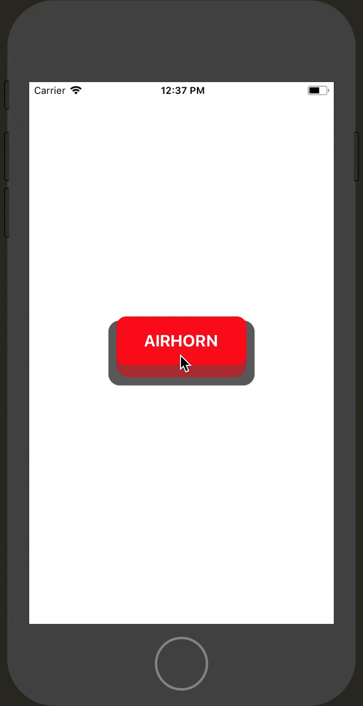
Now lets setup our button base. Here will just be a rectangular backdrop. Our container centers everything in the middle of the screen so we'll need to provide a width/height. In our case we'll create a base that is 80x180.
<TouchableWithoutFeedback onPressIn={this.handleAirhorn}>
  <View style={styles.button}>
    <View style={styles.outer} />
  </View>
</TouchableWithoutFeedback>
Then we create our outer section. It'll take up all the space we have and add in some padding. This padding will create the backdrop for which our button will sit inside. Here we give it a dark grey, you can give it whatever color you like.
Additionally we round the borders.
button: {
    height: 80,
    width: 180,
},
outer: {
    flex: 1,
    padding: 10,
    backgroundColor: "rgba(0,0,0,0.65)",
    borderRadius: 14,
},
Inner Button
Now for our our actual button. There will be 2 parts. The first is the fake height, which we've given the style height. It's just a rounded rectangle to render into with a red background at .5 opacity.

Inside of that we then render our inner button style. We need to specify height: '100%' or we'll just get a button that will be the size of whatever our text renders as. We also give it a background color, and center our child content which is just going to be our white text.

<Animated.View style={[styles.height]}>
  <Animated.View style={[styles.inner]}>
    <Text style={styles.white}>AIRHORN</Text>
  </Animated.View>
</Animated.View>
height: {
backgroundColor: "rgba(255, 0, 0, .5)",
borderRadius: 16,
},
inner: {
height: "100%",
backgroundColor: "red",
alignItems: "center",
justifyContent: "center",
},
white: {
color: "#FFF",
fontWeight: "bold",
fontSize: 20,
},At the moment we have our inner button piece taking up the same exact space as height piece. So the red inner is hiding all of that.

Interpolations
To make the actual press animation look like a 3D press is happening we need to create an Animated.Value.
state = {
  animation: new Animated.Value(0),
};
We need to create 2 effects. The first is our offset, which we use a negative margin. What this will do is move the wrapping height upward. This will create an overlap with the outer button base. Then to give the fake height appearance we add in paddingBottom.
This is going to add in spacing so that the dark red background appears, but then the actual red top part will fill in the rest.

const heightStyle = {
  marginTop: this.state.animation.interpolate({
    inputRange: [0, 1],
    outputRange: [-15, 0],
  }),
  paddingBottom: this.state.animation.interpolate({
    inputRange: [0, 1],
    outputRange: [15, 0],
  }),
};
The whole point of this interpolation is to start by move the whole button upwards with the negative offset. Then with our bottom spacing we have the background peak through. When we animate to 1 the margin will decrease from -15 to 0 which will make the button appear to move downward.
We still have our padding that is showing the darker red background which we don't want. We will then animate that to 0 create a depressing button effect.
We also want to animate our border radius so as the button is animated into the border box it takes the same border radius as the outer height wrap so that nothing is visible and that all the dark background is completely covered.
const inner = {
  borderRadius: this.state.animation.interpolate({
    inputRange: [0, 1],
    outputRange: [12, 16],
  }),
};
Pop those animated styles onto their respective containers and you'll have your rendering button look something like this.
The reason we use interpolate is so that all our animations can be connected to a single value.
<TouchableWithoutFeedback onPressIn={this.handleAirhorn}>
  <View style={styles.button}>
    <View style={styles.outer}>
      <Animated.View style={[styles.height, heightStyle]}>
        <Animated.View style={[styles.inner, inner]}>
          <Text style={styles.white}>AIRHORN</Text>
        </Animated.View>
      </Animated.View>
    </View>
  </View>
</TouchableWithoutFeedback>
Animate 3D Effect
Now to actually trigger our animation we need animate the value. We setup our interpolations all based on a single 0 to 1 value. This makes it easier to animate multiple items that need to be all tied together. Especially when there a simple boolean "pressed" or "not pressed" involved.
So when we press in on our button we trigger our airhorn sound and start our Animated.timing over a 100ms and animate to a value of 1.
handleAirhorn = async () => {
  try {
    const sound = new Audio.Sound();
    await sound.loadAsync(require("./assets/airhorn.mp3"));
    await sound.playAsync();
    Animated.timing(this.state.animation, {
      toValue: 1,
      duration: 100,
    }).start();
  } catch (e) {}
};
Our button will stay animated in until we apply a onPressOut to talk to trigger the reverse of our animation.
<TouchableWithoutFeedback onPressIn={this.handleAirhorn} onPressOut={this.handleButtonUp}>The reverse of our animation is animating back to 0 but in half the time.
handleButtonUp = () => {
  Animated.timing(this.state.animation, {
    toValue: 0,
    duration: 50,
  }).start();
};
It doesn't matter if you press the button again before the 50ms is complete it'll re-trigger the pressing animation and animate to 1 from whatever point the animated value is at. Also because we've built everything from interpolations they will all respond correctly.
Smash That Airhorn
That should do it! Check it out in action, and give the live version a try so you can have your very own airhorn button app!