Animated Input Label with Chrome Autofill Detection in React

Introduction
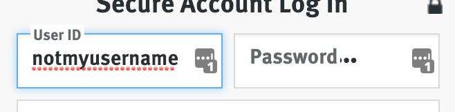
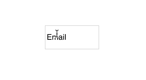
Chances are you've had Chrome autofill a form for you. The data fills in with a yellow background and content you didn't have to type. This provides a great experience for you as a user but they give very little ability to developers to know that things have been filled in.
This can lead to broken user interfaces like this. Lets see how we can avoid this with our own UIs.
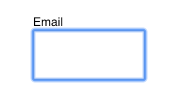
Input with Label
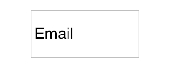
This is mostly applicable to interfaces where the input label covers up the input. Lets start with creating an input with a label.
We want this to be a controlled form so we first setup some state. We create a wrapping label element and put our actual text inside a span and also our input inside of our label. The input inside of our label will actually help with accessibility.
import React, { Component, createRef } from "react";
import "./app.css";

class App extends Component {
  state = {
    value: "",
  };

  render() {
    const { value } = this.state;

    return (
      <div className="App">
        <label className="input_container">
          <span className="label">Email</span>
          <input
            className="input"
            value={value}
            name="email"
            onChange={(e) => this.setState({ value: e.target.value })}
          />
        </label>
      </div>
    );
  }
}

export default App;
Our input container will use flex and column direction to stack our actual label and input. We need to make it relative as well once we center our label over the input. Additionally the margin-top is to make exact space for our label when it retracts.
.input_container {
  position: relative;
  display: flex;
  flex-direction: column;
  margin-top: 16px;
}

.label {
  font-size: 16px;
  line-height: 16px;
  font-family: Helvetica, sans-serif;
}

.input {
  height: 30px;
  width: 100px;
  padding: 8px 4px;
  font-size: 18px;
}
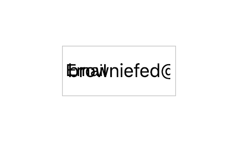
Center our Label
In order to center our label we use a transform technique combined with absolutely positioning. By setting top: 50% it will move the label down 50% of the container height. The transform: translateY(-50%) moves it back upwards 50% of the labels height.
We also add in pointer-events: none; so when the user taps on the input it'll ignore our label and go to the input directly to focus.
.label {
  font-size: 16px;
  line-height: 16px;
  position: absolute;
  left: 4px;
  top: 50%;
  transform: translateY(-50%);
  transition: all 0.25s ease;
  pointer-events: none;
}
Detect Autofill
The only indicator Chrome gives us is by applying the css pseudo class :-webkit-autofill to our input element. We need a way to indicate to our React component that the :-webkit-autofill was applied.
To do this we take advantage of CSS animations. We create 2 totally empty animations with distinct names that we can look for later in our component.
@keyframes onAutoFillStart {
}

@keyframes onAutoFillCancel {
}
Then on our input when it has the :-webkit-autofill we immediately apply our animation called onAutoFillStart. When we don't have :-webkit-autofill we execute the onAutoFillCancel.
Also the background-color transition will make it take a really long time before the yellow background shows up but that's not necessary for this technique to work.
.input:-webkit-autofill {
  animation-name: onAutoFillStart;
  transition: background-color 50000s ease-in-out 0s;
}

.input:not(:-webkit-autofill) {
  animation-name: onAutoFillCancel;
}
To get access to animations starting we can use the onAnimationStart event. We pass this along to a function called handleAutoFill.
<input
  className="input"
  value={value}
  name="email"
  onAnimationStart={this.handleAutoFill}
  onChange={(e) => this.setState({ value: e.target.value })}
/>
We need a bit of state now to control whether or not we're auto filling. We add in a hide value on state, and look at our e.animationName to see if it's equal to our onAutoFillStart animation.
We created an onAutoFillCancel however it's not necessary for this application because we have a singular animation on our input so if the started animation isn't onAutoFillStart then it means it's onAutoFillCancel.
However if you have multiple animations on a particular input you may need to look for onAutoFillCancel to determine if autofill was cancelled.
state = {
  value: "",
  hide: false,
};
handleAutoFill = (e) => {
  this.setState({
    hide: e.animationName === "onAutoFillStart",
  });
};
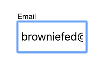
Hide if Filled
To move our label out of the way we can apply some CSS and with our previous transition setup the label will animate out of the way. Additionally we add back pointer-events in case the users wanted to copy the text from the label.
The -8px is 50% of our text height since we've added a translateY(-50%) we need to now overcome.
We'll start with something looking like this
.hide {
  top: -8px;
  left: 0;
  font-size: 12px;
  pointer-events: all;
}
Now we need to hide our label if the value is filled by applying our hide class name. We do some comparison if we have a value in the field or if our autofill has kicked off then we want to apply our hide label class name.
const { hide, value } = this.state;
const hideLabel = hide || value;
<label className="input_container">
  <span className={`label ${hideLabel ? "hide" : ""}`}>Email</span>
  <input
    className="input"
    value={value}
    name="email"
    onAnimationStart={this.handleAutoFill}
    onChange={(e) => this.setState({ value: e.target.value })}
  />
</label>
Hide when Focused/Blurred
We not only need to track autofilling but also if we blur/focus on the input. Setup an additional state piece to track the focus of the input.
state = {
  value: "",
  hide: false,
  focus: false,
};
Now if we have autofilled, focused, or have typed anything into our input we will hide our label.
render() {
  const { hide, focus, value } = this.state;
  const hideLabel = hide || focus || value;

  return (
    <div className="App">
      <label className="input_container">
        <span className={`label ${hideLabel ? "hide" : ""}`}>Email</span>
        <input
          className="input"
          value={value}
          name="email"
          onAnimationStart={this.handleAutoFill}
          onFocus={() => this.setState({ focus: true })}
          onBlur={() => this.setState({ focus: false })}
          onChange={e => this.setState({ value: e.target.value })}
        />
      </label>
    </div>
  );
}
Ending
Now you can detect when Chrome is autofilling and execute the code you need to provide a nice user interface.
As an Emotion user I decided to wrap this all up into a library https://github.com/browniefed/emotion-autofill-input