Create an Animated Circular Progress Indicator to Track Article Read Percentage in React

Intro
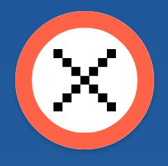
There are many reasons to show progress to our users. One of these is show cased on TechCrunch and its progress button in the corner showing how much of the article that you've read so far. Technically it's just as far as you've scrolled but it helps the user gauge how long an article is depending on how fast the circle fills up.
It also gives the user an action to close the article and when the article is complete there is a check mark and animation to give the user some feedback that they've completed. Also this minor celebration could be a reinforcement that could cause the user to read more articles, and read them completely.
Page Setup
We'll start with an article setup. We're not concerned with the content or anything we're mostly just concerned with the length of the article.
import React, { useState, useLayoutEffect, useRef } from "react";
import "./App.css";
import { CheckMark, Close } from "./icons";

function App() {
  return (
    <div className="App">
      <div className="article" />
    </div>
  );
}

export default App;
So rather than rendering an article content we'll just add in height, and give it a height of 3000px and add a gradient so we can see when we scroll.
.article {
  height: 3000px;
  background: linear-gradient(to bottom, #1e5799 0%, #7db9e8 100%);
}
These icons are pulled from Tech Crunch so I wouldn't recommend using them in production, but these are the icons we'll use for the X close and also the Checkmark for when the end of the article has been reached.
import React from "react";

export const CheckMark = () => {
  return (
    <svg viewBox="0 0 20 20" width="45px" height="45px" className="center-icon">
      <g fill="#FFF">
        <rect y={10} width={2} height={2} />
        <rect x={2} y={12} width={2} height={2} />
        <rect x={4} y={14} width={2} height={2} />
        <rect x={6} y={16} width={2} height={2} />
        <rect x={8} y={14} width={2} height={2} />
        <rect x={10} y={12} width={2} height={2} />
        <rect x={12} y={10} width={2} height={2} />
        <rect x={14} y={8} width={2} height={2} />
        <rect x={16} y={6} width={2} height={2} />
        <rect x={18} y={4} width={2} height={2} />
      </g>
    </svg>
  );
};

export const Close = () => {
  return (
    <svg viewBox="0 0 20 20" width="45px" height="45px" className="center-icon">
      <path d="M0,2.9h2.9V0H0V2.9z M2.9,5.7h2.9V2.9H2.9V5.7z M5.7,8.6h2.9V5.7H5.7V8.6z M8.6,11.4h2.9V8.6H8.6V11.4z M5.7,14.3h2.9v-2.9H5.7V14.3z M2.9,17.1h2.9v-2.9H2.9V17.1z M0,20h2.9v-2.9H0V20z M11.4,14.3h2.9v-2.9h-2.9V14.3z M14.3,17.1h2.9v-2.9h-2.9V17.1zM17.1,20H20v-2.9h-2.9V20z M11.4,8.6h2.9V5.7h-2.9V8.6z M14.3,5.7h2.9V2.9h-2.9V5.7z M17.1,2.9H20V0h-2.9V2.9z" />
    </svg>
  );
};
One thing we need to do is center our icon in the middle of the button. We do that with the position absolute, transform trick. How it works is we position absolutely top: 50% and left: 50% this will offset based upon the top/left corner of the icon and not be in the center. Then we translate the icon using transform up and back to the left which means we need to do -50%. Which will be half the width/height of the object. This will center it perfectly in the middle of the button regardless of the size of the icon.
.center-icon {
  position: absolute;
  top: 50%;
  left: 50%;
  transform: translate(-50%, -50%);
}
Create our Circle Button
Now we need to create a circular button. We add in a position: fixed and position in the top right corner. We need to fix it so that as the article scrolls we don't scroll the button away too.
return (
  <div className="App">
    <div className="article">
      <div
        style={{
          position: "fixed",
          top: "30px",
          right: "30px",
        }}
      >
        <button className="button" />
      </div>
    </div>
  </div>
);
Our button will need to be position: relative since we need to position our icons, and additionally our circular progress inside of the circle. So now all absolute positioning will be contained within it.
Our button will be 100x100 and so our border-radius we set to half of that to create a perfect circle.
.button {
  position: relative;
  width: 100px;
  height: 100px;
  border-radius: 50px;
  transition: all 0.3s ease;
  box-shadow: 0 2px 4px 0 rgba(0, 0, 0, 0.2);
  outline: none;
  cursor: pointer;
  border: 0;
  background-color: #fff;
}

Circular Progress
Now comes the part with the math. We create an SVG that is the same size as our button 100x100 but more importantly our viewBox is 50x50 so our available space to render that will be seen is 50x50. Things will scale correctly, but just know that the rendering size isn't a factor here at the moment.
<svg
  viewBox="0 0 50 50"
  width="100px"
  height="100px"
  className="circle-progress"
>
  <circle stroke="tomato" fill="transparent" />
</svg>
We give our circle a stroke color and remove any fill color so that we will only have a border, but no inner color. Also we'll place our circular progress SVG absolutely in the top left corner. The width/height of 100 will then match our button and it will fill it up perfectly.
.circle-progress {
  position: absolute;
  left: 0;
  top: 0;
}
Before we dive into the math a little bit lets explore the concept of what we're going to do. The stroke of an SVG element is equivalent to the border when dealing with DOM elements. There is more powerful control over how those get rendered in the SVG world. One feature we'll use is stroke-dasharray and stroke-dashoffset.
The stroke-dasharray allows you to control the length of each dash and also the spacing between each dash. It would look something like stroke-dasharray="10 5". This would indicate the each dash will be 10 in length and have a space of 5 before the next dash. The stroke-dashoffset property controls where along the path that dash will begin. So if you had a stroke-dashoffset="5" this would cause a half dash offset in the beginning.
So rather than creating multiple dashes we can use this technique to create one big dash. The dash will go around the entire length of the circle. Then we can use the stroke-dashoffset property to control how far into that dash we start rendering.
The concept being when you haven't the article at all we start the offset at the full length. That means it wouldn't render at all because the dash would start at 100% of it's length. However any time in between 0 - 100% of the article read we can adjust the stroke-dashoffset to render a partial dash around the circumference of the circle.
Here we have our circle, we need to define some variables.
<svg
  viewBox="0 0 50 50"
  width="100px"
  height="100px"
  className="circle-progress"
>
  <circle
    cx={DIAMETER / 2}
    cy={DIAMETER / 2}
    r={RADIUS}
    stroke="tomato"
    fill="transparent"
    strokeWidth={STROKE_WIDTH}
  />
</svg>
First we have our diameter. This is the full width of the circle. We want it to take up the whole viewBox so we set it to 50. The radius is half the diameter, so we would typically cut the diameter in half so 50/2 = 25. Combined with a stroke though this would put the stroke border right on the border of our circle.
With a stroke width of 6, that would mean it renders 3 inside and 3 outside of our allowed area. We want it to completely sit on the inside of our circle. This means we need to adjust our radius because we can't adjust the rendering position of our stroke.
So to calculate the correct radius we take our DIAMETER of 50. Divide by 2, then subtract our STROKE_WIDTH divided by 2.
So 50 / 2 = 25, then 25 - (6 / 2) = 22. The 6 just gives us a nice thick line, but if you wanted something less you could do 4 width, which would then give you a radius of 23 instead of 22.
const DIAMETER = 50;
const STROKE_WIDTH = 6;
const RADIUS = DIAMETER / 2 - STROKE_WIDTH / 2;
When dealing with stroke-dasharray we are creating a single dash around the whole length of the circle. To calculate the length around a circle we use the formula πr*2. We just calculated the radius, and we can access pi from Math.PI in JavaScript.
So our circumference is calculated as follows.
const CIRCUMFERENCE = Math.PI * RADIUS * 2;
Now we can fill in our strokeDasharray on our style with the entire circumference of the circle.
<svg
  viewBox="0 0 50 50"
  width="100px"
  height="100px"
  className="circle-progress"
>
  <circle
    cx={DIAMETER / 2}
    cy={DIAMETER / 2}
    r={RADIUS}
    stroke="tomato"
    fill="transparent"
    strokeWidth={STROKE_WIDTH}
    style={{
      strokeDasharray: CIRCUMFERENCE,
    }}
  />
</svg>
Track Scroll Progress
Before we can start showing the progress with our stroke-dashoffset we need get the percent of the article the user has scroll through.
We could put in 3000 since we know the height of the article we've created, but we'll calculate it dynamically. We'll need to get a ref to the DOM element so we can measure its height.
const articleRef = useRef();
So we create a ref with useRef() hook, and then apply it to our article div.
<div className="article" ref={articleRef} />
We'll also need a piece of state to track the progress of the article that has been read. We need it to be on state because updating it will cause a re-render and we can then use that to calculate our stroke-dashoffset
const [progress, setProgress] = useState(0);
The body is currently the element that is scrolling so we need to attach a listener to the window to listen to scrolls, and call updateHeight. We also return our clean up function and clean up our event listener.
useLayoutEffect(() => {
  window.addEventListener("scroll", updateHeight);
  return () => {
    window.removeEventListener("scroll", updateHeight);
  };
}, []);
We use the useLayoutEffect hook instead of useEffect because we want to measure the height of our article before the user sees it and then we can accurately update the status the user has read in the event the scroll position starts down the page.
The updateHeight function will be called on each scroll, as well as the first time the component is mounted which is what will update the state of the scroll position accordingly.
We get the bounds of our article div, and pull of the height. The window is scrolling so we can use window.scrollY to get the position the user is at, and then we can take our height of our article and subtract the innerHeight of the window. We do this because the scrollY will never reach the 3000 mark because it's reporting the value that's been scrolled by.
Then we finally call our setProgress to trigger our update.
const [progress, setProgress] = useState(0);
const articleRef = useRef();

useLayoutEffect(() => {
  const updateHeight = () => {
    if (!articleRef.current) return;

    const { height } = articleRef.current.getBoundingClientRect();

    setProgress(window.scrollY / (height - window.innerHeight));
  };

  updateHeight();

  window.addEventListener("scroll", updateHeight);
  return () => {
    window.removeEventListener("scroll", updateHeight);
  };
}, []);
Our dependency array is empty because we depend on only mutable things, and don't depend on the previous progress at all.
Now we calculate the position by taking 1 - progress, then we never want to below 0 which could be possible, and we want to use 0 as our floor value. We can use Math.max to always ensure we'll have a 0 ending value.
const position = Math.max(1 - progress, 0);

<svg
  viewBox="0 0 50 50"
  width="100px"
  height="100px"
  className="circle-progress"
>
  <circle
    cx={DIAMETER / 2}
    cy={DIAMETER / 2}
    r={RADIUS}
    stroke="tomato"
    fill="transparent"
    strokeWidth={STROKE_WIDTH}
    style={{
      strokeDasharray: CIRCUMFERENCE,
      strokeDashoffset: CIRCUMFERENCE * position,
    }}
  />
</svg>;
Then with our position read calculated we can multiply that by the circumference we calculated and have our dash offset starting at the correct spot.
Completion Effects
Finally we want to have some other completion effects. We can use our position we derived to determine if the article is starting, or completed. Completed would be when the user has reached 0 and the value starts at 1.
const complete = position === 0;
const notMoved = position === 1;
So when complete we'll switch our button background color, we'll also change from the X close to our checkmark completed. If we rendered when the user just started a little bit of the dash will show so we just won't render our circle indicator.
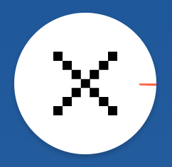
<button
  className="button"
  style={{
    backgroundColor: complete ? "tomato" : "#FFF",
  }}
>
  {complete ? <CheckMark /> : <Close />}
  {!notMoved && (
    <svg
      viewBox="0 0 50 50"
      width="100px"
      height="100px"
      className="circle-progress"
    >
      <circle
        cx={DIAMETER / 2}
        cy={DIAMETER / 2}
        r={RADIUS}
        stroke="tomato"
        fill="transparent"
        strokeWidth={STROKE_WIDTH}
        style={{
          strokeDasharray: circumference,
          strokeDashoffset: circumference * position,
        }}
      />
    </svg>
  )}
</button>
End
I didn't implement any action with the button, but that will be an exercise for you. Do something cool with your new found circular progress button. These concepts could apply to any other SVG, or progress. You just need to know the length of an SVG path. Additionally if you wanted to have the circle sit on the outside of the circle you could add instead of subtract our half stroke width.