Animated Color Palette Generator in React Native

Animated Color Palette Generator in React Native
To create an animated color palette generator we're going to use the Animated library supplied by React Native. Some external libraries for generating consistent colors. Also we will use useLayoutEffect, useEffect, and useState hooks to automatically respond to changes in state to cause our animations to trigger.
An inspiration from UIDesignDaily but with some added polish. Including animated from the previous color to the next color, and animating the toast message when a color is selected.
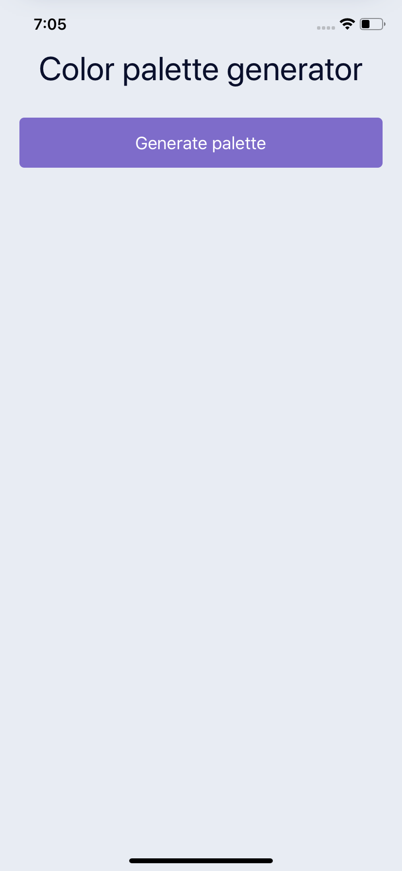
Setup a Title and Button
We'll need a few libraries to help us out in accomplishing our desired interactions. We'll use randomcolor to generate a random hex color, the hex-to-hsl helps us convert HSL so the animations are smoother from color to color. And our the react-use-previous will help us track what the previous colors were.
We'll touch more on these later
npm install hex-to-hsl react-use-previous randomcolor
// or
yarn add hex-to-hsl react-use-previous randomcolor
This will be our base component for now. We will first add a button that's a TouchableOpacity, as well as a title inside of our container.
import React from "react";
import { StyleSheet, Text, View, TouchableOpacity } from "react-native";
import usePrevious from "react-use-previous";
import hexToHsl from "hex-to-hsl";
import randomColor from "randomcolor";

export default function App() {
  return (
    <View style={styles.container}>
      <Text style={styles.title}>Color palette generator</Text>
      <View>
        <TouchableOpacity style={styles.generateButton}>
          <Text style={{ color: "#FFF", fontSize: 18 }}>Generate palette</Text>
        </TouchableOpacity>
      </View>
    </View>
  );
}
We create some styles, the first is our container to tell it to take up our entire screen with a background color. Then we supply our title style, and our generate button style.
const styles = StyleSheet.create({
  container: {
    flex: 1,
    paddingVertical: 50,
    paddingHorizontal: 20,
    backgroundColor: "#E8ECF3",
  },
  title: {
    fontSize: 34,
    color: "#0A102C",
    textAlign: "center",
    marginBottom: 30,
  },
  generateButton: {
    backgroundColor: "#7E6CCA",
    shadowOffset: { width: 0, height: 0 },
    shadowRadius: 6,
    shadowColor: "#7E6CCA",
    borderRadius: 5,
    paddingVertical: 15,
    alignItems: "center",
    justifyContent: "center",
  },
});
Create a Color Card Component
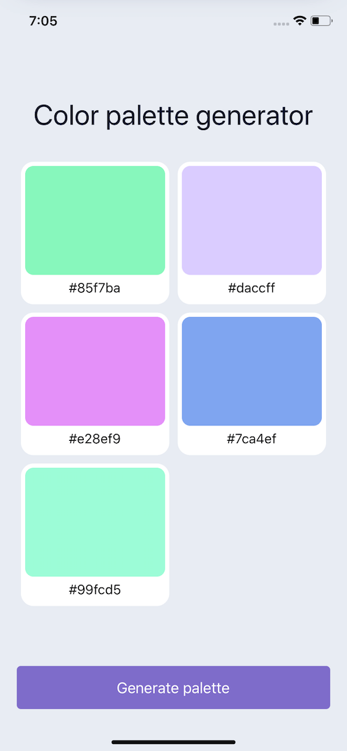
Next we need to create our ColorCard. This will be a component that we use for rendering all of our colors. So it needs to take 2 props. The first is the color prop and the second is the onPress so we can trigger the toast animation later when a user presses on the color card.
Because we need to handle a press we wrap in a TouchableOpacity. The outer wrap is set to 50% so that we can display 2 cards side by side. Then we take our color that we passed in and set it on an Animated.View so we can animate this color later.
const ColorCard = ({ color, onPress }) => {

  return (
    <TouchableOpacity
      style={{
        width: "50%",
        height: 180,
        padding: 5,
      }}
      onPress={onPress}
    >
      <View
        style={{
          padding: 5,
          backgroundColor: "#FFF",
          borderRadius: 15,
          height: "100%",
        }}
      >
        <Animated.View
          style={{
            backgroundColor: color
            padding: 10,
            borderRadius: 10,
            flex: 1,
          }}
        />
        <View
          style={{
            paddingVertical: 5,
            alignItems: "center",
            justifyContent: "center",
          }}
        >
          <Text
            style={{
              fontSize: 16,
            }}
          >
            {color}
          </Text>
        </View>
      </View>
    </TouchableOpacity>
  );
};
Generate Random Colors
Now that we have a card to render we need to create some colors to actually render.
First we setup a function to get a random color. This is just a helper function that will return a call to the randomcolor library. This can be adjusted based upon the styles of colors you want to generate.
Also depending on how many you want to generate you can control by setting a differing amount on state. Here I made a function called get5New that we can call at any time to get a new set of 5 colors.
const getColor = () => {
  return randomColor({
    luminosity: "light",
    hue: "random",
  });
};

const get5New = () => {
  return [getColor(), getColor(), getColor(), getColor(), getColor()];
};
In our app we'll just bootstrap the initial state by calling our function and returning the first array of 5 colors.
const [colors, setColors] = useState(get5New());
Depending on the screen size the height of our cards may not fit on the screen. So we will wrap it in a ScrollView. We set the outer to flex: 1 so that the ScrollView will take up the rest of the available space, and the button will take up the rest.
You can then have the button stay clickable, and all the colors scrollable.
Another key piece to this is setting our View wrapping our ColorCards to flexDirection: 'row' and also setting it to flexWrap: 'wrap'. This will then let each card render in a row, 2 at a time then wrap others to the next line.
<ScrollView style={{ flex: 1 }}>
  <View
    style={{
      flex: 1,
      justifyContent: "center",
    }}
  >
    <Text style={styles.title}>Color palette generator</Text>
    <View
      style={{
        flexDirection: "row",
        flexWrap: "wrap",
      }}
    >
      {colors.map((color, index) => {
        return <ColorCard key={index} color={color} />;
      })}
    </View>
  </View>
</ScrollView>
Now that we can update our colors, we can add an onPress to our button and update our colors state with a whole new set of 5 colors.
<View>
  <TouchableOpacity
    style={styles.generateButton}
    onPress={() => {
      setColors(get5New());
    }}
  >
    <Text style={{ color: "#FFF", fontSize: 18 }}>Generate palette</Text>
  </TouchableOpacity>
</View>
Animate the Color when Changed
In order to animate from one color to another we need to keep track of what the previous color was. We can use the react-use-previous hook to pass in our color. Upon changing the prevColor will hold onto what our previous color was.
In order to render an initial color we will set our prevColor to the current color in the event we don't have one. Which we won't until the color changes once.
const [animation] = useState(new Animated.Value(0));
const prevColor = usePrevious(color)?.current || color;
Then we can use the useLayoutEffect hook. This will allow us to update the animation state accordingly before the user can see it. This plays a key part in conjunction with our interpolate call below. We use the color prop as the hook dependency so that when the color changes our effect will re-run causing our animation to trigger.
The Animated.timing takes our animation value that we're interpolating off of and animates it to 1 over 1000ms
useLayoutEffect(() => {
  animation.setValue(0);
  Animated.timing(animation, {
    toValue: 1,
    duration: 1000,
    useNativeDriver: false,
  }).start();
}, [color]);
The interpolate will create a smooth transition from a 0 => 1 value but turned into colors. When the component re-renders with a new color we need to quickly shift the color rendered to 0 and transition it to 1. The color will quickly swap when we call the setValue(0) in our useLayoutEffect. With our interpolate our inputRange goes from 0 to 1 and our outputRange are our 2 colors.
When a color changes the color the view is, quickly becomes the prevColor. The inputRange is set back to 0. So we are still rendering the color the view was showing. Then our animation kicks off and animates to 1 which will be the actual current color supplied by props.
Converting from hex to hsl color format allows us to have smooth color animations from one color to the next with out jumping around from color to color like rgb would.
<Animated.View
  style={{
    backgroundColor: animation.interpolate({
      inputRange: [0, 1],
      outputRange: [getHSLString(prevColor), getHSLString(color)],
    }),
    padding: 10,
    borderRadius: 10,
    flex: 1,
  }}
/>
This uses the hex-to-hsl library and then using destructuring we can grab each piece and return the necessary string.
const getHSLString = (color) => {
  const [h, s, l] = hexToHsl(color);
  return "hsl(" + h + "," + s + "%," + l + "%)";
};
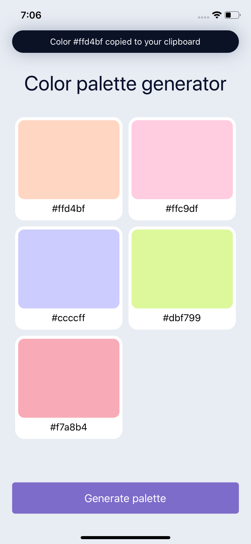
Create a Toast
For a more reusable component we first create an independent toast component. It receives the color, and renders.
const ToastBar = ({ color }) => {
  return (
    <View style={styles.toast}>
      <Text
        style={{
          color: "#FFF",
        }}
      >
        Color {color} copied to your clipboard
      </Text>
    </View>
  );
};
The toast component being it's own independent component means we can wrap it and position it anywhere, as well as animate it however we want.
We'll start by positioning the toast exactly where we want it to appear, and then can move it away with our animation. We'll place it at the 50 points from the top and 20 from each side.
<Animated.View style={[styles.toastPosition]}>
  <ToastBar color={selectedColor} />
</Animated.View>
toastPosition: {
    position: "absolute",
    top: 50,
    left: 20,
    right: 20,
    zIndex: 10,
},
toast: {
    backgroundColor: "#0C1226",
    shadowColor: "#A8B2C3",
    shadowOffset: { width: 0, height: 0 },
    shadowRadius: 15,
    shadowOpacity: 1,
    borderRadius: 29,
    paddingHorizontal: 20,
    paddingVertical: 10,
    alignItems: "center",
    justifyContent: "center",
}
Animate a Toast Alert
To animate our toast we need to hold onto 2 pieces of state. The first being the color that was pressed, and then also the animated value to bring the toast into view.
const [selectedColor, setSelectedColor] = useState();
const [animatedValue] = useState(new Animated.Value(0));
We can setup a useEffect hook to watch for a color to be selected. Which we add as a dependency [selectedColor] to our hook.
If a color is selected we will trigger our animation.
useEffect(() => {
  if (selectedColor) {
  }
}, [selectedColor]);
For our toast, we will animate from 0 to 1 and use interpolate to move it in and out of view. At 0 which is the initial value, we will translate the toast off screen -100. So it will sit above the screen but out of view.
When animated to 1 the translateY will be 0 and the toast bar will sit at the spot we positioned it with no animation applied.
<Animated.View
  style={[
    styles.toastPosition,
    {
      transform: [
        {
          translateY: animatedValue.interpolate({
            inputRange: [0, 1],
            outputRange: [-100, 0],
          }),
        },
      ],
    },
  ]}
>
  <ToastBar color={selectedColor} />
</Animated.View>
To trigger the animation we do need to use the onPress function prop and call the setSelectedColor function to update state.
<ColorCard
  key={index}
  color={color}
  onPress={() => {
    setSelectedColor(color);
  }}
/>
For our animation we want the toast to appear, but not linger. So we want to to hide eventually. To do this we can utilize the sequence functionality provided by Animated. We reset our animatedValue back to 0 so the toast is hidden. Then we trigger sequence to spring into place. We animate to 1 which our interpolate will go from -100 to 0 and our toast will appear.
Then we use delay to wait 1 second. Then we spring back to 0.
useEffect(() => {
  if (selectedColor) {
    animatedValue.setValue(0);
    Animated.sequence([
      Animated.spring(animatedValue, {
        toValue: 1,
        useNativeDriver: true,
      }),
      Animated.delay(1000),
      Animated.spring(animatedValue, {
        toValue: 0,
        useNativeDriver: true,
      }),
    ]).start();
  }
}, [selectedColor]);
Ending
Now we have a complete animated color palette generator. We went over Animated and how we can create sequences of animations to show, wait, and then hide an item. As well as how to use interpolate to leverage animated values to transition colors.