Create a Multi-Step Animated Modal Depending on User Actions in React Native

Introduction
Animations can be used to effectively communicate a users action. However many times the reverse animation is used for both a close, or success. We can do better, and we'll walk through how to use Animated to create 2 different animations with a single animated value.
Set the Scene
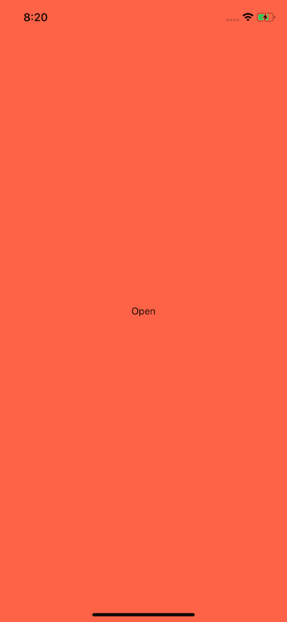
Lets set the scene. We need a button to open the modal, and a background. We'll make our background a tomato color so we can see our modal overlay transition easier.
We will also setup our animation. We'll use a useState hook and the callback style of useState. Like so
const [animation] = useState(() => new Animated.Value(0));
We do this because this will prevent a new Animated.Value being instantiated each render. Use state will only ever use the first one, so even if you did useState(new Animated.Value(0)) all would function. We just save ourselves a bit of overhead each render.
import React, { useState } from "react";
import {
  StyleSheet,
  Text,
  View,
  TouchableOpacity,
  Animated,
  Dimensions,
} from "react-native";

export default function App() {
  const [animation] = useState(() => new Animated.Value(0));

  return (
    <View style={styles.container}>
      <TouchableOpacity
        onPress={() => {
          Animated.spring(animation, {
            toValue: 1,
          }).start();
        }}
      >
        <Text>Open</Text>
      </TouchableOpacity>
    </View>
  );
}

const styles = StyleSheet.create({
  container: {
    flex: 1,
    backgroundColor: "tomato",
    alignItems: "center",
    justifyContent: "center",
  },
});

Create The Modal
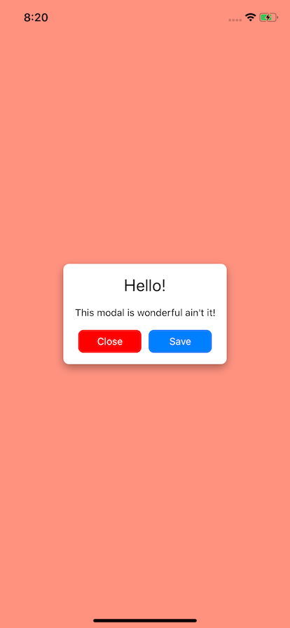
Now we need to create our modal. We could use Modal but we will focus on the animations and just setup our modal using absolute positioning to cover the screen.
We create 2 animation view wraps. The first is so we can transition the background color alone, and the second is for scaling and other transformations. If we use the same View the background transition would be effected by scale and other transform transitions.
<Animated.View pointerEvents="box-none" style={[styles.background]} />
<Animated.View style={[styles.background]} />
The rest our modal is just some content and styling.
<View style={styles.wrap}>
  <View style={styles.modalHeader}></View>
  <Text style={styles.headerText}>Hello!</Text>
  <Text style={styles.regularText}>This modal is wonderful ain't it!</Text>
  <View
    style={{
      flexDirection: "row",
    }}
  >
    <TouchableOpacity style={[styles.button, styles.buttonCancel]}>
      <Text style={styles.buttonText}>Close</Text>
    </TouchableOpacity>
    <TouchableOpacity style={styles.button}>
      <Text style={styles.buttonText}>Save</Text>
    </TouchableOpacity>
  </View>
</View>
You can view the full text and styling below.
import React, { useState } from "react";
import {
  StyleSheet,
  Text,
  View,
  TouchableOpacity,
  Animated,
  Dimensions,
} from "react-native";

export default function App() {
  const [animation] = useState(() => new Animated.Value(0));

  return (
    <View style={styles.container}>
      <TouchableOpacity
        onPress={() => {
          Animated.spring(animation, {
            toValue: 1,
          }).start();
        }}
      >
        <Text>Open</Text>
      </TouchableOpacity>
      <Animated.View pointerEvents="box-none" style={[styles.background]}>
        <Animated.View style={[styles.background]}>
          <View style={styles.wrap}>
            <View style={styles.modalHeader}></View>
            <Text style={styles.headerText}>Hello!</Text>
            <Text style={styles.regularText}>
              This modal is wonderful ain't it!
            </Text>
            <View
              style={{
                flexDirection: "row",
              }}
            >
              <TouchableOpacity style={[styles.button, styles.buttonCancel]}>
                <Text style={styles.buttonText}>Close</Text>
              </TouchableOpacity>
              <TouchableOpacity style={styles.button}>
                <Text style={styles.buttonText}>Save</Text>
              </TouchableOpacity>
            </View>
          </View>
        </Animated.View>
      </Animated.View>
    </View>
  );
}

const styles = StyleSheet.create({
  container: {
    flex: 1,
    backgroundColor: "tomato",
    alignItems: "center",
    justifyContent: "center",
  },
  background: {
    position: "absolute",
    left: 0,
    top: 0,
    right: 0,
    bottom: 0,
    alignItems: "center",
    justifyContent: "center",
  },
  wrap: {
    borderRadius: 8,
    backgroundColor: "#FFF",
    padding: 16,
    shadowColor: "#000",
    shadowOffset: {
      width: 0,
      height: 5,
    },
    shadowOpacity: 0.34,
    shadowRadius: 6.27,

    elevation: 10,
  },
  headerText: {
    textAlign: "center",
    fontSize: 24,
  },
  regularText: {
    textAlign: "center",
    fontSize: 14,
    marginTop: 16,
  },
  button: {
    backgroundColor: "#007ffe",
    paddingHorizontal: 10,
    paddingVertical: 8,
    borderRadius: 8,
    marginTop: 16,
    flex: 1,
    marginHorizontal: 5,
  },
  buttonCancel: {
    backgroundColor: "red",
  },
  buttonText: {
    color: "#FFF",
    fontSize: 14,
    textAlign: "center",
  },
});

Opening Animation
Now lets focus on our animation. We want to do an opening animation that consists of fading in the background, then scaling in the modal content.
We will do this in 2 phases but use a singular animated value.
First our background we will interpolate. From 0 to .2. The first 20% of the animation will just be animation the background from transparent to 30% white. One key piece is extrapolate: "clamp". Without this the background will continue animating all the way white and will not stop.
const background = animation.interpolate({
  inputRange: [0, 0.2],
  outputRange: ["rgba(255,255,255,0)", "rgba(255,255,255,.3)"],
  extrapolate: "clamp",
});
Then we focus on our scaling animation. We start at .2 and end at 1. Our output will feed into our scale so at .2 we start at 0 scale, and at 1 we hit our full scale at 1. Again it's crucial that we add our extrapolate since we will have a multi-step animation and use different segments to control the action.
const display = animation.interpolate({
  inputRange: [0.2, 1],
  outputRange: [0, 1],
  extrapolate: "clamp",
});
const [animation] = useState(() => new Animated.Value(0));

const background = animation.interpolate({
  inputRange: [0, 0.2],
  outputRange: ["rgba(255,255,255,0)", "rgba(255,255,255,.3)"],
  extrapolate: "clamp",
});

const display = animation.interpolate({
  inputRange: [0.2, 1],
  outputRange: [0, 1],
  extrapolate: "clamp",
});
Now we need to wire up the background animation, and the display animation. You may also notice that we have added pointerEvents="box-none". This will allow us to have a view that we can animate but doesn't steal touches. It isn't apart of the scale view so it'll just be sitting over our application the entire time and we want touches to pass through it.
<Animated.View
  pointerEvents="box-none"
  style={[
    styles.background,
    {
      backgroundColor: background,
    },
  ]}
/>
<Animated.View
  style={[
    styles.background,
    {
      transform: [
        {
          scale: display,
        },
      ],
    },
  ]}
/>
When the Open button in the beginning is pressed it will animate from 0 to 1 and trigger all of these animations.
<TouchableOpacity
  onPress={() => {
    Animated.spring(animation, {
      toValue: 1,
    }).start();
  }}
>
  <Text>Open</Text>
</TouchableOpacity>
Closing Animation
Our closing animation can be the same as our opening since we want to communicate to the user that nothing has happened. We do that by animating back to 0. Our animation will go in reverse. The view will scale out, and the background will then fade.
<TouchableOpacity
  style={[styles.button, styles.buttonCancel]}
  onPress={() => {
    Animated.spring(animation, {
      toValue: 0,
    }).start();
  }}
>
  <Text style={styles.buttonText}>Close</Text>
</TouchableOpacity>
Success Animation
Our success animation will fly up off the screen rather than scale and fade out. This means we need a second step in our animation from 1 to 2. One thing with using Animated.spring is it creates a more natural animation but will spring past the value. So we must set our success animation to start at 1.1 so the translate effect isn't triggered.
This might be a case where using 2 animated values might be better but managing 1 can sometimes be a bit easier.
Our output will be from 0 to -height. So it won't matter what amount of content is on the screen it'll all scale off appropriately.
const { height } = Dimensions.get("window");

const success = animation.interpolate({
  inputRange: [1.1, 2],
  outputRange: [0, -height],
  extrapolate: "clamp",
});
Our success button we will animate to 2 and trigger our interpolation. So we have the correct animation when we press Open again we need to reset the animation back to 0.
<TouchableOpacity
  style={styles.button}
  onPress={() => {
    Animated.spring(animation, {
      toValue: 2,
    }).start(() => {
      animation.setValue(0);
    });
  }}
>
  <Text style={styles.buttonText}>Save</Text>
</TouchableOpacity>
So that the background doesn't just disappear immediately when we reset to 0 we can adjust the background animation to have a 4 part inputRange. We can setup between .2 and 1.8 that the background color will stay the same. Then in the first 20% and last 20% of our animations we will have it animate away.
const background = animation.interpolate({
  inputRange: [0, 0.2, 1.8, 2],
  outputRange: [
    "rgba(255,255,255,0)",
    "rgba(255,255,255,.3)",
    "rgba(255,255,255,.3)",
    "rgba(255,255,255,0)",
  ],
  extrapolate: "clamp",
});
Ending
Using a single Animated.Value along with interpolation is an effective way to control a multi-phase animation that will allow you to communicate to the user different results of their actions. I show off using a single animated value here, however there may be times where it is more advantageous to use multiple.
However in this case when the animations are simpler and there are 2 steps taking advantage of extrapolate can mean an easier time dealing with the animations. It can also mean we can setup 100% reversible animations by default.