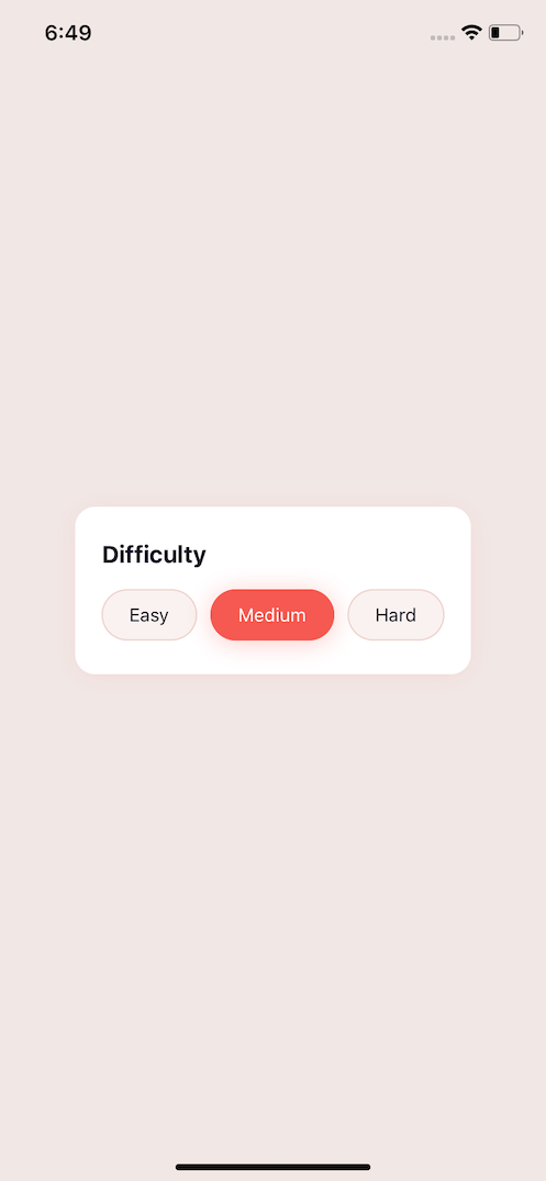
Create a Recipe Difficulty Component

Setup
To find the referenced sketch file visit UIDesignDaily and download it. This will contain many different components you can build. We will focus on a component that displays the difficulty level of a recipe.
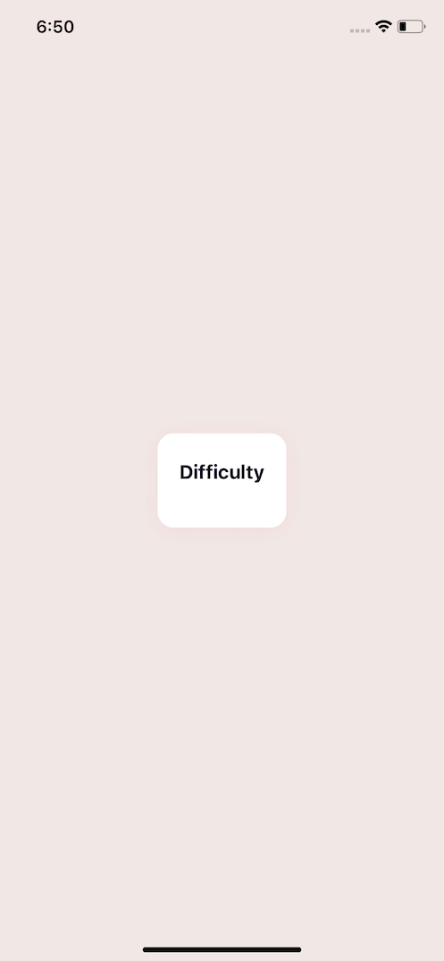
Creating our Container
To create our container we set flex: 1 to take up the entire available space. To center content in the middle of the screen we use 2 spacer elements that are both flex: 1. This then allows for our actual content to be dynamic in size and the rest of the space can be filled. This only matters for demonstration purposes.
export default function App() {
  return (
    <View style={styles.container}>
      <View style={styles.spacer} />
      <View style={styles.whiteWrap}>
        <Text style={styles.title}>Difficulty</Text>
      </View>
      <View style={styles.spacer} />
    </View>
  );
}
Our wrapping box component and title will lay the foundation for our display. The whiteWrap will align all of our content at the start, and then justify all the content to have space between each. This is where the body container applying alignItems: ‘center’ actually affects this. Without it the whole box would be the full width of our screen and the display badges would have set sizes. So this actually helps us achieve a better look. We add in a light shadow, and add in various paddings.
Our title we add 16 points of spacing, bold it, increase the font size, and give it a color.
<View style={styles.whiteWrap}>
  <Text style={styles.title}>Difficulty</Text>
</View>
const styles = StyleSheet.create({
  whiteWrap: {
    backgroundColor: "#FFFFFF",
    shadowColor: "#F55951",
    shadowOffset: { width: 0, height: 2 },
    shadowOpacity: 0.1,
    shadowRadius: 10,
    borderRadius: 15,
    paddingHorizontal: 20,
    paddingVertical: 25,
    flexDirection: "column",
    alignItems: "flex-start",
    justifyContent: "space-between",
  },
  title: {
    marginBottom: 16,
    fontWeight: "bold",
    fontSize: 18,
    color: "#111127",
  },
});
All put together our base code for our component looks like this.
import React from "react";
import { StyleSheet, Text, View } from "react-native";

export default function App() {
  return (
    <View style={styles.container}>
      <View style={styles.spacer} />
      <View style={styles.whiteWrap}>
        <Text style={styles.title}>Difficulty</Text>
      </View>
      <View style={styles.spacer} />
    </View>
  );
}

const styles = StyleSheet.create({
  container: {
    flex: 1,
    backgroundColor: "#F1E8E6",
    paddingHorizontal: 10,
    alignItems: "center",
  },
  spacer: {
    flex: 1,
  },
  whiteWrap: {
    backgroundColor: "#FFFFFF",
    shadowColor: "#F55951",
    shadowOffset: { width: 0, height: 2 },
    shadowOpacity: 0.1,
    shadowRadius: 10,
    borderRadius: 15,
    paddingHorizontal: 20,
    paddingVertical: 25,
    flexDirection: "column",
    alignItems: "flex-start",
    justifyContent: "space-between",
  },
  title: {
    marginBottom: 16,
    fontWeight: "bold",
    fontSize: 18,
    color: "#111127",
  },
});
Create the Badges
To create our badge we’ll create a new component. The children prop will just be the text that gets displayed. We’ll first create the base component and then from there we will apply style overrides to turn it into a different selected look.
const Badge = ({ children }) => {
  return (
    <View style={[styles.badge]}>
      <Text style={[styles.badgeText]}>{children}</Text>
    </View>
  );
};
We will need to create a new wrapper for all of our badges, and set it to flexDirection: ‘row’ . Then align all the content to the center and give it a width of 100% to fill the entire white box wrap. Additionally so that each badge doesn’t run up right next to each other we add a wrapping View around our center badge and give it 10 points of padding on both sides.
<View style={styles.whiteWrap}>
  <Text style={styles.title}>Difficulty</Text>
  <View style={styles.badgeRow}>
    <Badge>Easy</Badge>
    <View style={{ paddingHorizontal: 10 }}>
      <Badge>Medium</Badge>
    </View>
    <Badge>Hard</Badge>
  </View>
</View>
Our badge will consist of a background color, with some padding, border color, and to the round the corners we give it a border radius.
const styles = StyleSheet.create({
  // other styles
  badgeRow: {
    flexDirection: "row",
    alignItems: "center",
    width: "100%",
  },
  badge: {
    backgroundColor: "#FAF2F0",
    borderWidth: 1,
    borderColor: "#EDD2CB",
    borderStyle: "solid",
    borderRadius: 22,
    paddingHorizontal: 20,
    paddingVertical: 10,
  },
  badgeText: {
    color: "#111127",
  },
});

Selected Badges
For our selected badges we can pass a selected prop. Using this prop we can use the array format to conditionally apply our selected style to our badge and selectedText style to our text.
const Badge = ({ children, selected }) => {
  return (
    <View style={[styles.badge, selected && styles.selected]}>
      <Text style={[styles.badgeText, selected && styles.selectedText]}>
        {children}
      </Text>
    </View>
  );
};
To trigger it we need to pass selected to the badge in the middle.
<View style={{ paddingHorizontal: 10 }}>
  <Badge selected>Medium</Badge>
</View>
Our selected override styles will override the backgroundColor as well as the borderColor to match. Then applying a shadow and changing the selected text to white.
const styles = StyleSheet.create({
  //other styles
  selected: {
    backgroundColor: "#F55951",
    shadowColor: "#F55951",
    shadowOffset: { width: 0, height: 2 },
    shadowOpacity: 0.3,
    shadowRadius: 10,
    borderColor: "#F55951",
  },
  selectedText: {
    color: "#FFF",
  },
});
Final