Create a Segmented Auto-Moving SMS Code Verification Input in React Native

Intro
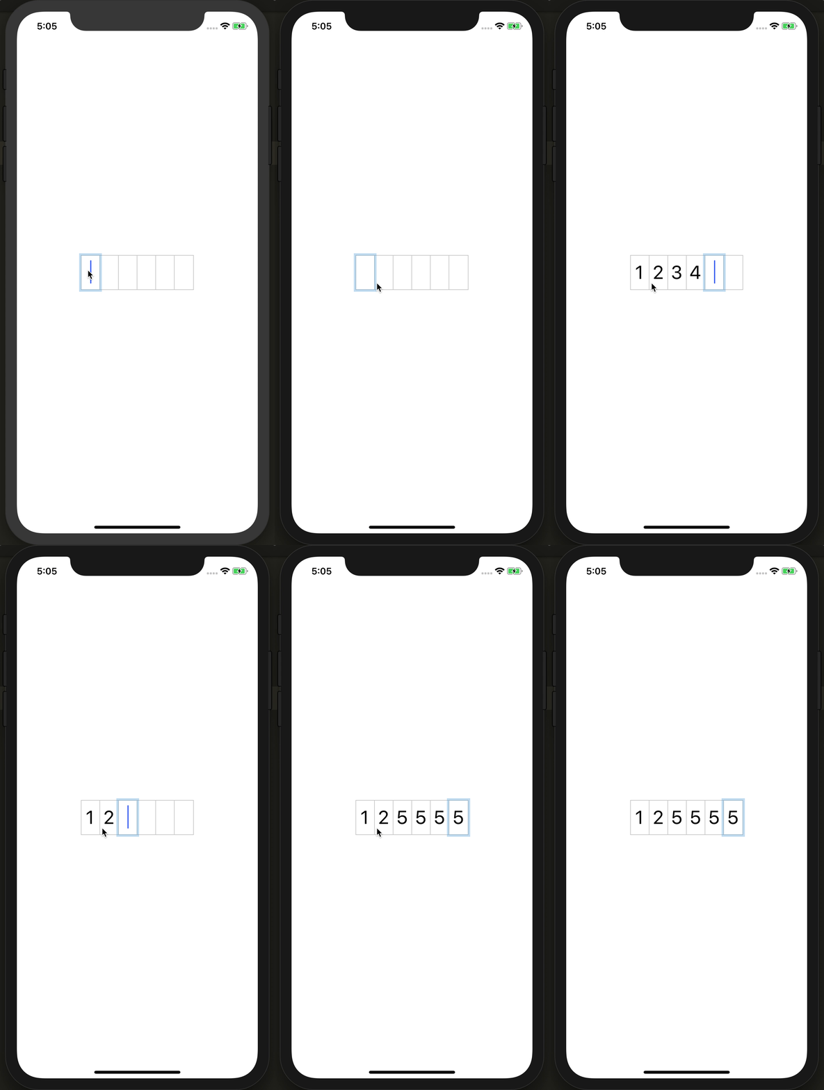
Many applications provide a way to verify a user based upon a text message. This can be a random code usually 4-6 numbers. It doesn't really matter as we'll build an input that can do it all, but one common interaction is auto-advancing inputs when you type.
This on the surface can look trivial but can be complex when you are dealing with user interactions like pasting, deleting, and focus management.
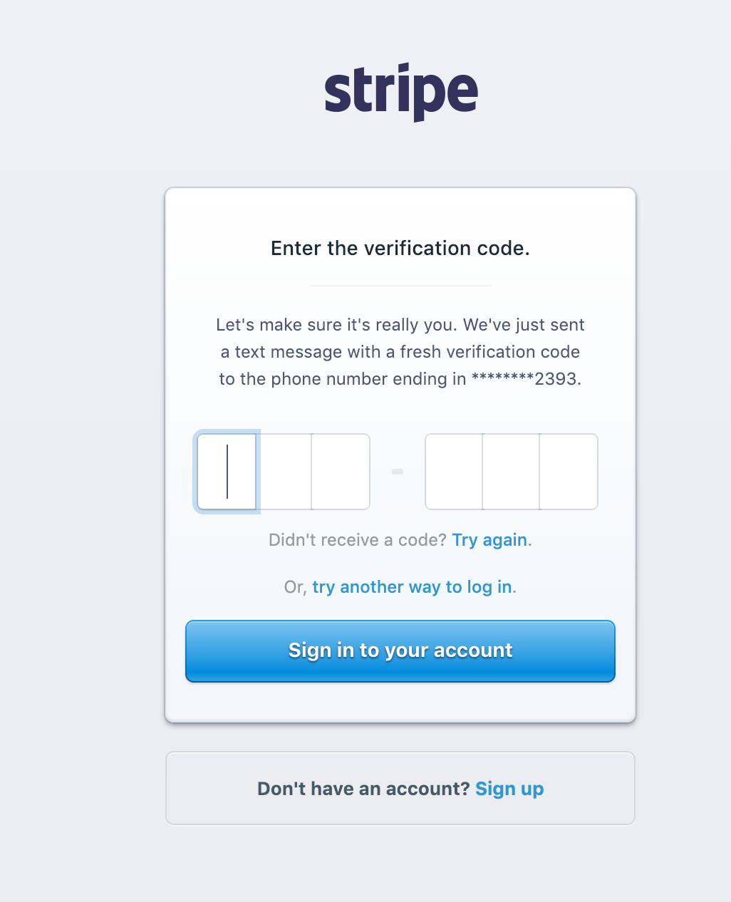
This tutorial was inspired by logging into Stripe and seeing how they handled their text code verification. This was adapted from web to native.
Setup 6 Rectangles
6 is arbitrary this will work with any amount as long as we base our calculations off of the length of the array.
const CODE_LENGTH = new Array(6).fill(0);
We start with a bit of state. We will hold our value in a single string and use the split method to turn it into an array. We will loop over our CODE_LENGTH just so we can grab the index and render in our display value.
class App extends Component {
  state = {
    value: "",
  };
  render() {
    const { value } = this.state;
    const values = value.split("");

    return (
      <View style={styles.container}>
        <View style={styles.wrap}>
          {CODE_LENGTH.map((v, index) => {
            const removeBorder =
              index === CODE_LENGTH.length - 1 ? styles.noBorder : undefined;
            return (
              <View style={[styles.display, removeBorder]} key={index}>
                <Text style={styles.text}>{values[index] || ""}</Text>
              </View>
            );
          })}
        </View>
      </View>
    );
  }
}

export default App;
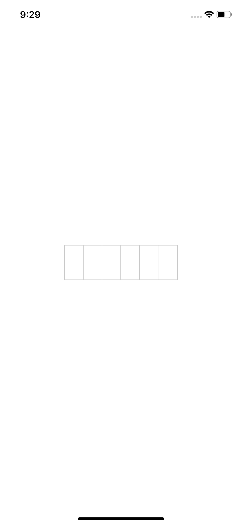
Our display value will be Views that have their border right the same color and size as the wrap. The wrapping div will provide the border look, and the display pieces will provide the separation on the inside.
We will use some logic to remove the border from the last display so we don't have a double border on the right side from the display and wrap border. If it's the last input we apply our noBorder style.
We also use use alignItems: 'center' and justifyContent: 'center' to center our text inside of each display cell.
const styles = StyleSheet.create({
  container: {
    flex: 1,
    alignItems: "center",
    justifyContent: "center",
  },
  wrap: {
    borderWidth: 1,
    borderColor: "rgba(0, 0, 0, 0.2)",
    position: "relative",
    flexDirection: "row",
  },
  display: {
    borderRightWidth: 1,
    borderRightColor: "rgba(0, 0, 0, 0.2)",
    width: 32,
    height: 58,
    alignItems: "center",
    justifyContent: "center",
    overflow: "visible",
  },
  text: {
    fontSize: 32,
  },
  noBorder: {
    borderRightWidth: 0,
  },
});
Setup Our Input
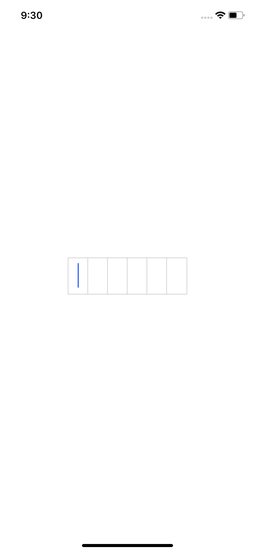
We need to get access to our TextInput via a ref so we can control it's focus.
class App extends Component {
  input = React.createRef();
}
We render our TextInput, and one important piece is to put value="". The reason for this is to indicate to React that it's a controlled input, and that even if people type into we never want to display a value.
If we left that off the text input would be uncontrolled and would have user input displayed. Instead of displaying the content in the input we have our value split from state and rendered in separate Views.
<View style={styles.wrap}>
  <TextInput value="" ref={this.input} style={[styles.input]} />
</View>
We will render our input absolutely because we will want to control the movement of it later so that we don't have to fake a cursor but instead move the input to the active cell.
  input: {
    position: "absolute",
    fontSize: 32,
    textAlign: "center",
    backgroundColor: "transparent",
    width: 32,
    top: 0,
    bottom: 0,
  }
Handle Focus/Blur
On important piece is controlling focus and blur. We will need to track whether or we have focus so we can display appropriate outlines. So we add a boolean focused value to state, and attach an onFocus and onBlur to our input.
state = {
  value: "",
  focused: false,
};

handlePress = () => {
  this.input.current.focus();
};
handleFocus = () => {
  this.setState({ focused: true });
};
handleBlur = () => {
  this.setState({
    focused: false,
  });
};
const { value, focused } = this.state;
Not only that we need to handle what happens when the user presses on the outer wrap. If it's pressed we need to focus on the input. In React Native we want to use a Touchable element, in our case the TouchableWithoutFeedback since we don't need any other effects. So we add an onPress and call focus on our ref that we had created earlier.
Calling focus directly like this will then trigger our onFocus handler so we don't need to set any state in the handlePress method.
<TouchableWithoutFeedback onPress={this.handlePress}>
  <View style={styles.wrap}>
    <TextInput
      value=""
      ref={this.input}
      onFocus={this.handleFocus}
      onBlur={this.handleBlur}
      style={[styles.input]}
    />
  </View>
</TouchableWithoutFeedback>
Move Our Input
One important piece is moving the input. As the user types we will move it starting from position 0 through to the full length of the code. We do this so as the user types the input can display in the cell with a real cursor flashing.
We do some math to determine the selected index to multiply by 32 which is just the width of each display cell.
If our current length of typed in code is less than the total possible values then we return the values.length which is just the length of characters users have typed in.
If we hit the point where the user has typed in all possible characters then we just return the total possible length of characters. This limits the input to always be visible in the last square and no further.
const selectedIndex =
  values.length < CODE_LENGTH.length ? values.length : CODE_LENGTH.length - 1;

<TextInput
  value=""
  ref={this.input}
  onFocus={this.handleFocus}
  onBlur={this.handleBlur}
  style={[
    styles.input,
    {
      left: selectedIndex * 32,
    },
  ]}
/>;
Handle Typing
Now when the user types we will have our change event fire. Generally you would update state with just updating the value from onChangeText but because we added value="" the value will always be the singular character that the user typed.
We are reference previous state so we need to use the callback setState style.
handleChange = (value) => {
  this.setState((state) => {
    if (state.value.length >= CODE_LENGTH.length) return null;
    return {
      value: (state.value + value).slice(0, CODE_LENGTH.length),
    };
  });
};
<TextInput
  value=""
  ref={this.input}
  onChangeText={this.handleChange}
  onFocus={this.handleFocus}
  onBlur={this.handleBlur}
  style={[
    styles.input,
    {
      left: selectedIndex * 32,
    },
  ]}
/>
Also the handleChange method could be potentially called with more than one character if the user pasted in the number. So to combat any possibility of over pasting past the maximum character limit we will combine the current state, new incoming value, then slice it down to the maximum length.
If a user pasted in 8 characters we would grab 0 to 6 in our case and only update the state with the first 6 characters.
Also if the current length is greater than or equal to maximum code length we return null. This will prevent typing in more than the allowed amount or characters.
Fake Outline
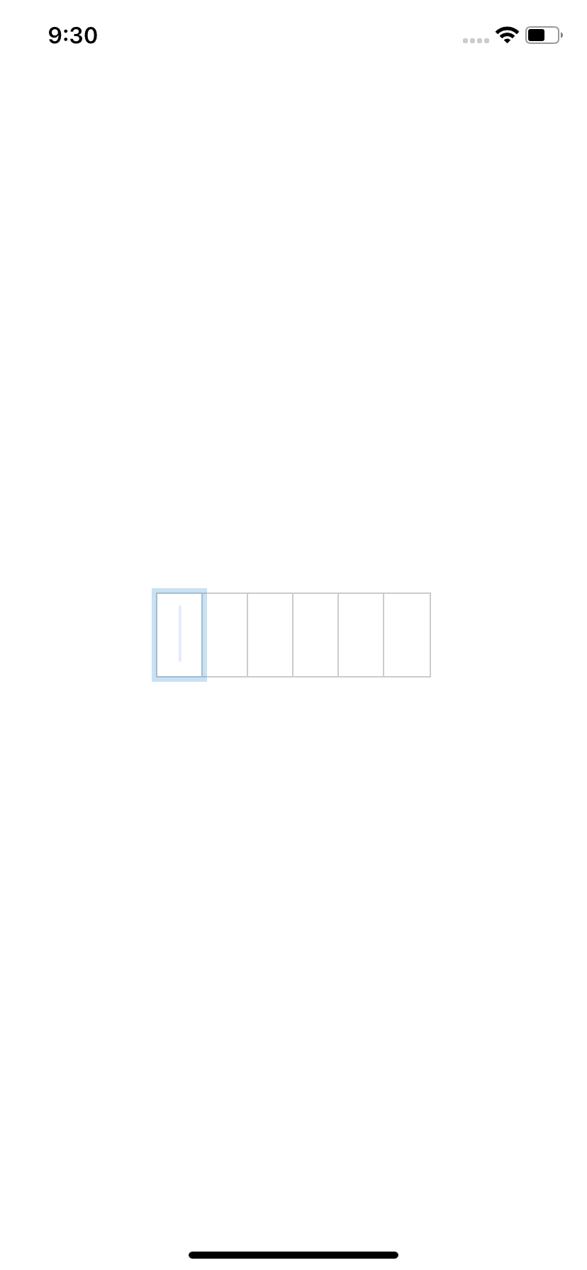
Accessibility is important to think about and so we will need to re-create the outline that would normally display when the user has focus. We could add in the outline but choose to do it this way for better design/aesthetic purposes.
To accomplish this we need to know if a current cell is selected, or if everything is all filled in.
If it's currently selected we want to render our outline, or if all numbers have been filled in then we want to render the outline in the last input. We do that by comparing the index we are looping over directly to the length of the characters that have been typed in.
Then to check if it's filled we compare length of values typed in and also check if the loop has gotten to the final input.
{
  CODE_LENGTH.map((v, index) => {
    const selected = values.length === index;
    const filled =
      values.length === CODE_LENGTH.length && index === CODE_LENGTH.length - 1;
    const removeBorder =
      index === CODE_LENGTH.length - 1 ? styles.noBorder : undefined;

    return (
      <View style={[styles.display, removeBorder]} key={index}>
        <Text style={styles.text}>{values[index] || ""}</Text>
        {(selected || filled) && focused && <View style={styles.shadows} />}
      </View>
    );
  });
}
We also need to check if the user is currently focused. If they aren't focused on the input then we don't want to render our outline.
To render the outline we render another div positioned absolutely. We render our shadow View absolutely and give it a borderWidth of 4. Then we move it left/right/bottom/top -4 so that when the border renders it will line up exactly like an outline.
shadows: {
  position: "absolute",
  left: -4,
  top: -4,
  bottom: -4,
  right: -4,
  borderColor: "rgba(58, 151, 212, 0.28)",
  borderWidth: 4,
}
Handle Delete
We will need to handle deleting manually because the input doesn't have any value. So there is no way to detect a value change to remove a number. We can grab the key from the onKeyPress callback and check if it's backspace. If the user is deleting then we can use slice to remove the last character from our value on state.
handleKeyPress = (e) => {
  if (e.nativeEvent.key === "Backspace") {
    this.setState((state) => {
      return {
        value: state.value.slice(0, state.value.length - 1),
      };
    });
  }
};

<TextInput
  value=""
  ref={this.input}
  onChangeText={this.handleChange}
  onKeyPress={this.handleKeyPress}
  onFocus={this.handleFocus}
  onBlur={this.handleBlur}
  style={[
    styles.input,
    {
      left: selectedIndex * 32,
    },
  ]}
/>;
Handle Edge Cases
One final edge case is to handle when the user has fully typed in the amount of characters. They can type in 5 characters and be focused on the 6th, but once they type in the final character the selectedIndex will move the input to the right.
However if we have all the numbers, the input will be trying to collect a character for stuff we don't want/need. Typically in React you'd just un-render the input but if the user clicks on our wrapping div we need to have access to the TextInput so we can focus. Otherwise after the user typed in all the numbers they'd have no way to delete them if they got them wrong.
const hideInput = !(values.length < CODE_LENGTH.length);
To handle this we will check if the user has typed in all characters than just hide the input using opacity.
<TextInput
  value=""
  ref={this.input}
  onChangeText={this.handleChange}
  onKeyPress={this.handleKeyPress}
  onFocus={this.handleFocus}
  onBlur={this.handleBlur}
  style={[
    styles.input,
    {
      left: selectedIndex * 32,
      opacity: hideInput ? 0 : 1,
    },
  ]}
/>
Ending
That's it, we now have an input that auto-advances whenever you type it in and stops when the maximum character limit is reached.
