Create the James Bond Introduction in CSS and React

Intro
The James Bond opening intro show cases a gun barrel moving along and dropping circles behind it which you can check out here on Youtube
This is an interesting concept to build on the web to show case how to use transitions and CSS animations together to create the concept.
Concept
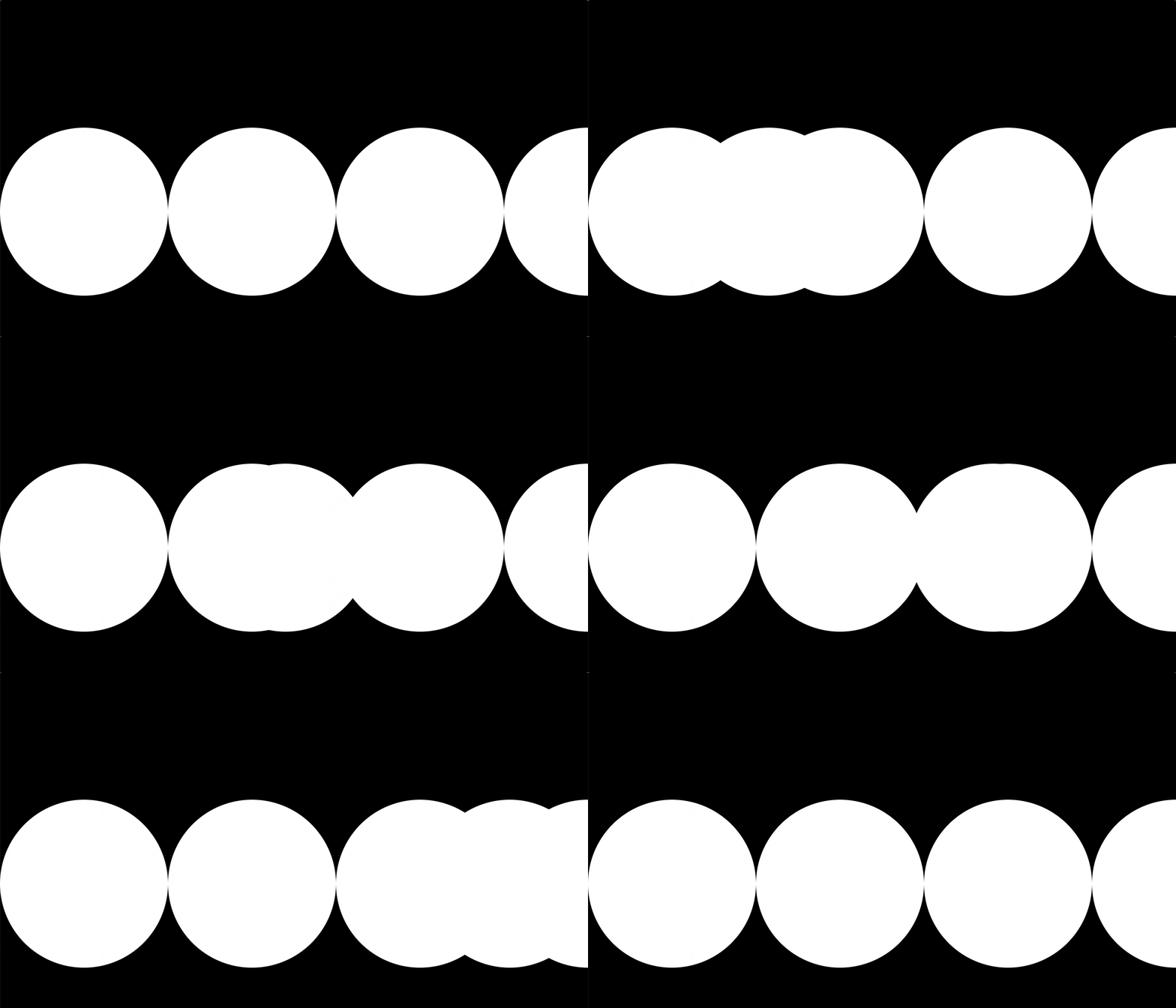
One possible concept is staggering the movement of circles, showing one and moving a second one backwards and another forwards. An easier concept to implement is to create a single circle that moves across the screen. At specific increments we can show a circle and then hide it.
Create Circles
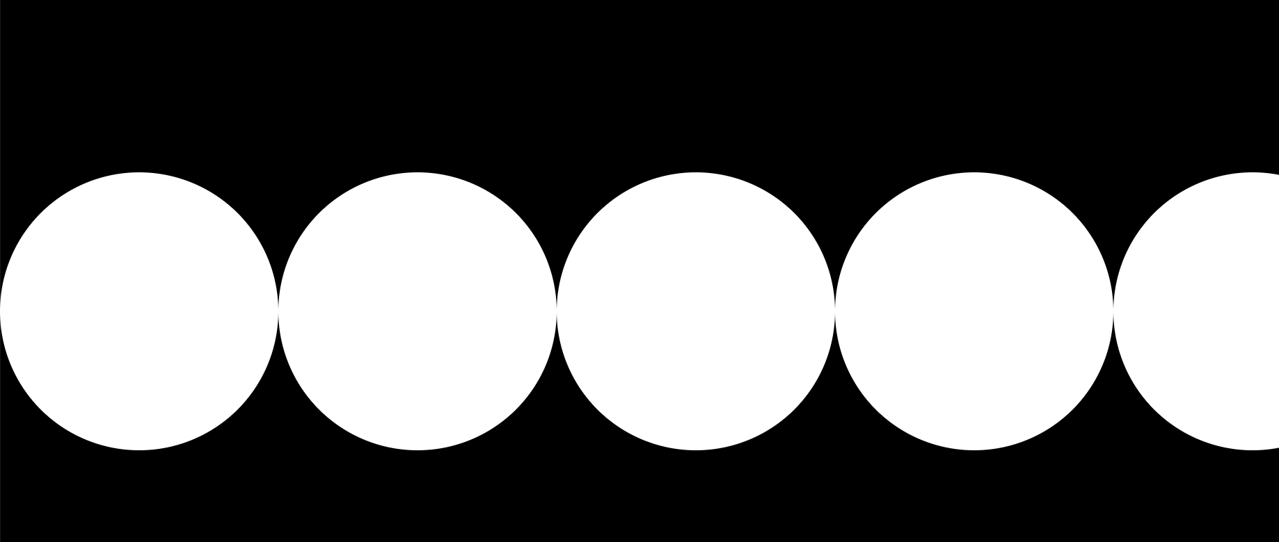
So to go ahead with the second concept we need to create some circles. We're going to settle on a circle that is 200px big. We need to calculate the number of circles that we are going to display on the screen so we take the width of the window, divide it by 200, and take the ceiling of that. This will add an extra circle so we'll animate off the screen.
Then we create an array from the circle count and then render some circles.
import React, { Component } from "react";
import "./app.css";

const circleCount = Math.ceil(window.innerWidth / 200);
const circles = Array.from(Array(circleCount).keys());

class App extends Component {
  render() {
    return (
      <div className="App">
        <div className="container">
          {circles.map((i) => {
            return <div className="circle" />;
          })}
        </div>
      </div>
    );
  }
}

export default App;
Some other CSS is required as well for this to work. So the movement circle and the row of circles layout don't offset each other we create a container.
That container is display: 'flex' so our circles appear in a row then we transform it and position it absolutely so it's centered.
body {
  margin: 0;
  padding: 0;
}

.App {
  height: 100vh;
  display: flex;
  align-items: center;
  justify-content: center;
  background-color: #000;
}

.circle {
  width: 200px;
  height: 200px;
  border-radius: 50%;
  background-color: #fff;
}

.container {
  position: absolute;
  top: 50%;
  left: 0;
  display: flex;
  transform: translateY(-50%);
}

Create The Movement Circle
Now lets create the circle that moves across the screen. We can re-use our circle class to make an identical circle then apply a mover class which we'll add specific code to.
<div className="circle mover" />
Our mover class looks to center our circle just like our container. This will allow them to line up seamlessly.
.mover {
  position: absolute;
  top: 50%;
  left: 0;
  transform: translateX(0) translateY(-50%);
}
Move the Circle
For the movement circle we can take advantage of transitions in CSS. However one aspect of CSS transitions is a change needs to occur. If a change doesn't occur then the transition won't take place.
That means we need to have a little bit of state to apply a starting position then one tick later apply and end position and let the transition take place.
We can achieve this with a setTimeout in componentDidMount that toggles a boolean piece of state.
state = {
  animate: false,
};
componentDidMount = () => {
  setTimeout(() => {
    this.setState({
      animate: true,
    });
  }, 0);
};
Now we need to setup our style to change based upon the animate flag being flipped.
We setup our transform to adjust the translateX from 0 when animate if false, and then to circle count we have times the width of the circle.
The second piece is the transition we need to define the length of the transition based upon the number of circles we have. So the circle will consistently move across the screen predictably. We do this by multiply .75 times the circle count, so that means we'll need a new circle to appear every .75 seconds.
The final key piece is defining the style of transition. We define a linear curve which means our circle will move along a straight bezier curve. Other styles like ease will have the circle move slower in the beginning, faster in the middle, and then slow as it approaches the end. So we must use linear or the animations won't line up.
<div
  className="circle mover"
  style={{
    transform: `translateX(${
      !this.state.animate ? "0px" : circleCount * 200
    }px) translateY(-50%)`,
    transition: `transform ${circleCount * 0.75}s linear`,
  }}
/>

Stagger Circle Animations
Now that we have a circle moving across the screen lets toggle our circle visibility. We create an animation keyframe and will cause each circle to jump to an opacity of 1 at 5% of the animation. It'll go until 99.99% and then at the end will jump to opacity: 0. This will cause no transition between states. If you just specified 100% with opacity of 0, then it would slowly fade out. We want it to disappear immediately. This is an animation cliff.
@keyframes bond {
  5% {
    opacity: 1;
  }
  99.99% {
    opacity: 1;
  }
  100% {
    opacity: 0;
  }
}
Finally we create a new class to apply. We can apply this to circle since our circle is being used for the movement circle and the pop in circles.
We set the default of our circle to be hidden with the opacity: 0, then pass in our animation by name. We give it a .75s since that's what we are using to calculate the full transition of the moving circle. Again a linear transition, and apply a forwards style. Technically this isn't necessary but it just means the final state of the animation will stay applied. So the circle will stay hidden.
This isn't technically necessary since the circle started with an opacity of 0, but it's just good to define.
.item {
  opacity: 0;
  animation: bond 0.75s linear forwards;
}
Then we apply our new style item to each circle. Then we need to create the appropriate delay. We don't want all the animations to kick off right away we need them to wait for their turn. We can specify the delay based upon the current index we're rendering times .75 seconds per circle animation.
<div className="container">
  {circles.map((i) => {
    return (
      <div
        className="circle item"
        style={{
          animationDelay: `${i * 0.75}s`,
        }}
      />
    );
  })}
</div>
Ending
There we have it! We built the initial introduction to the James Bond movies. This is less of a practical web development example and more of an article for fun. We got to explore utilizing transitions and CSS animations together.
