Fundamentals of Rendering Data as an SVG Bar Graph with D3 and scaleBand

Intro
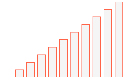
Bar graphs are one of the foundations of the graphing world. We'll walk through how to take data, transform it using scaleBand and scaleLinear to create a dynamic bar chart to fit into any width/height.

Setup
To get setup we import some data, specify a width/height to work with and render our svg so we have a place to render our bars.
import React, { Component } from "react";
import { data } from "./data";

const width = 500;
const height = 300;

class App extends Component {
  render() {
    return (
      <div>
        <svg width={width} height={height} />
      </div>
    );
  }
}
Selectors
These are our JavaScript data selectors. When given a data point from the array of data they will select the appropriate key.
So if your data had a value like price instead of y, you'd have d.price being returned for our ySelector.
const xSelector = (d) => d.x;
const ySelector = (d) => d.y;
Our data structure example
[
  {
    x: 0,
    y: 1, // Just so it shows up :)
  },
  {
    x: 1,
    y: 50,
  },
  {
    x: 2,
    y: 100,
  },
  {
    x: 3,
    y: 150,
  },
];
//...
Scales
We need to start by importing our 2 scales from d3-scale.
import { scaleBand, scaleLinear } from "d3-scale";
scaleBand is used to create an output range is continuous and numeric.
Basically the concept of scaleBand is take an output area (some width), take our data and amount of data points, split it into bands.
A band in our case can be considered each bar. This is why we need to know how many pieces of data we have. In our example data we have 10 bars. With the current width, as well as known data points it will figure out how wide each bar is.
Not only will it divide our content into each specific bar by width but we can apply padding. This will allow us to create an even spacing of each band aka each bar.
Read more about scaleBand in the D3 documentation d3-scale#band-scales.
const xScale = scaleBand()
  .range([0, width])
  .domain(data.map((d) => xSelector(d)))
  .padding(0.3);
So here we have our range of rendering which will be constrained to [0, width], so from [0, 500]. Then we will pass in our domain.
Our domain will be an array of our data points so it can calculate how many bars we need to place into 500 pixels of space. Finally we toss some padding on. This will set our innerPadding and outerPadding to the same value.
innerPadding being between each band aka each bar. The outerPadding being on the left and right sides after all bands are rendered. The padding must be inbetween 0 and 1. We set it to .3 so that it's roughly a 1/3 of the width of a bar as spacing. If we set it to .5 the padding and the bars would all be equal widths.
Our scaleLinear function will map our domain of y value data which sits between 0 and 500 as the max value. Which will map it to the height of our svg we're rendering into.
const yScale = scaleLinear().range([height, 0]).domain([0, 500]);
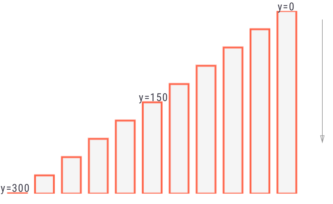
The reason why the height is mapped to the 0 of our data is that the top left corner of an SVG is 0,0. When graphing 0 is generally on the bottom. So in order to map our 0 value to render at the bottom we map it to the height of our svg.
Calculate Bars
We need to map over each of our data pieces and we'll calculate the data needed to render using our scales that we created. Each bar will eventually be rendered separately.
{
  data.map((d, i) => {
    const yValue = yScale(ySelector(d));
    const barHeight = height - yValue;
  });
}
Our yScale(ySelector(d)) is calculating the y value. You may think that we are rendering from the bottom up because that's how you're viewing it but what we're doing is actually rendering from the top down. Remember everything originates from 0,0 in the corner.
So for a value of 0 we've mapped it to the height of 300. So in our case a value that's 0 would be rendered at y=300. Then based upon the value of which we are rendering at we need to render it down to the bottom of the svg which is at 300.
In the middle of our values it will be at y=150. So we'll start our rendering in the middle, and render a bar that is 150px as well. Then for our value that is at the very top our y is going to be 0 so it will start it's rendering at the top, and thus our bar height will be 300px.

Render Bars
To render a bar we just use the rect.
First off we use width={xScale.bandwidth()} to get the bar width which is automatically calculated for us based upon the range and domain that we set. This will make sure that our bars fit in the space we've set.
Then we have our height={barHeight}, it's calculated from the y point minus the height. As mentioned before the y value is going to be the top of the bar, and then we're rendering down towards the bottom of the SVG.
The x={xScale(xSelector(d))} will take our value, select the x off of it and then pass it through to our xScale which is our scaleBand. This will take into account the number of bars we have, as well as the padding we've set and give us our x value to render.
The y will just be our yValue that we've calculated with our scaleLinear.
return (
  <div>
    <svg width={width} height={height}>
      {data.map((d, i) => {
        const yValue = yScale(ySelector(d));
        const barHeight = height - yValue;

        return (
          <rect
            key={i}
            width={xScale.bandwidth()}
            height={barHeight}
            x={xScale(xSelector(d))}
            y={yValue}
            stroke="#ff6347"
            strokeWidth={3}
            fill="#f5f5f5"
          />
        );
      })}
    </svg>
  </div>
);
Upside Down
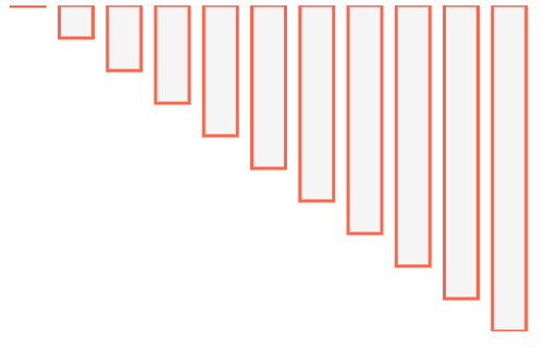
Now if we wanted to render our data in an upside down fashion all we need to do is make one small tweak. Rather than render at our yValue we just render at 0. The barHeight will be correctly calculated from our scales, but we're just changing the point at which it starts rendering.
So to accomplish this pop in y={0}.
<rect
  key={i}
  width={xScale.bandwidth()}
  height={barHeight}
  x={xScale(xSelector(d))}
  y={0}
  stroke="#ff6347"
  strokeWidth={3}
  fill="#f5f5f5"
/>

Ending
There we have it! We took some data and using 2 different scale methods were able to turn it into a bar graph that can be rendered into dynamic width/height containers.
